Princeton University Art Museum Website Redesign
The Princeton University Art Museum (PUAM) partnered with Bluecadet to create a digital experience as bold, inclusive, and forward-looking as its new building. The website needed to reflect the museum’s bold design and architectural ambition while also serving a diverse and intellectually curious community of students, scholars, and the public. Our goal was to design a site that matches the spirit of the new museum: open, connective, and built for engagement.
Visit Site︎︎︎
2025
UI/UX, Website
Client
Princeton University Art Museum
Team
Troy Lachance, Creative Director
Nina Callaway, Lead Strategist
Xinran Zhou, Lead Designer
UI/UX, Website
Client
Princeton University Art Museum
Team
Troy Lachance, Creative Director
Nina Callaway, Lead Strategist
Xinran Zhou, Lead Designer
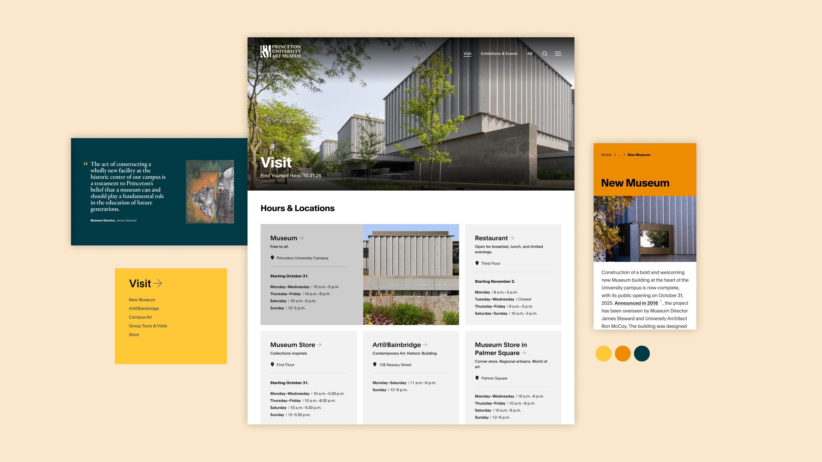
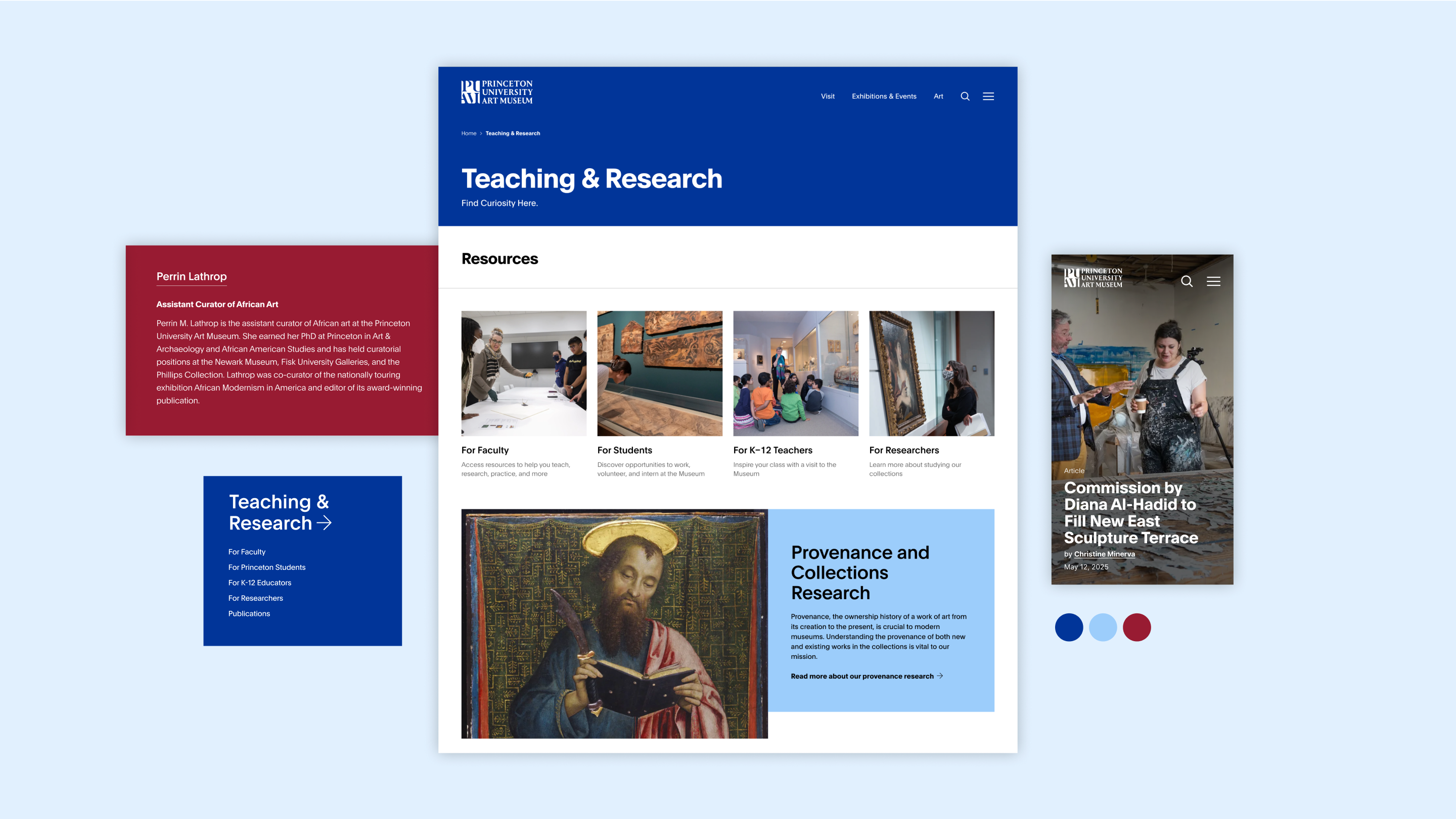
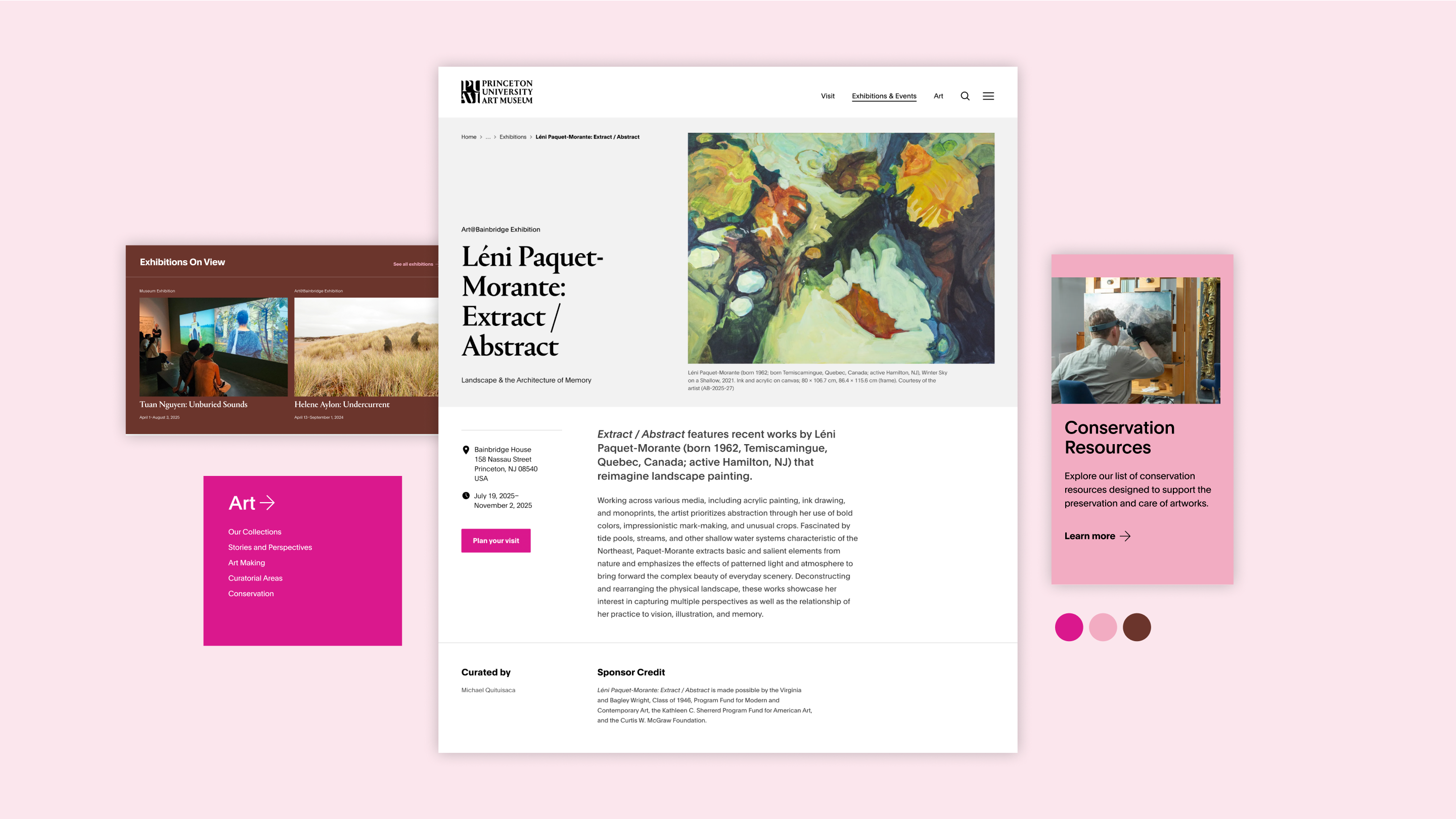
Extending the new brand online
Working closely with the visual identity developed by the agency 2x4, we translated the new brand into a digital language. Bold crops of artwork create immediacy and intrigue. Refined typography and a confident color palette guide users without overwhelming the art, striking a balance between clarity and sophistication.
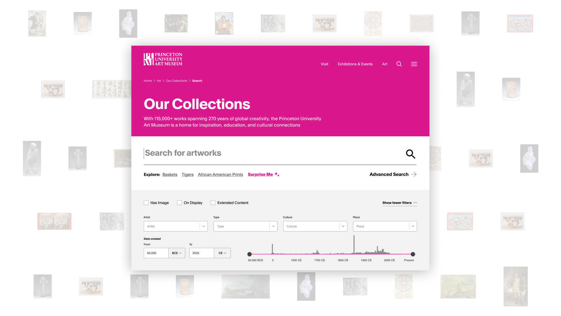
A robust collection search
The new website features a robust collection search for exploring over 117,000 works. Visitors can use helpful suggestions, smart filters like year, culture, and place made, and a “surprise me” option to spark discovery. An advanced search tool supports detailed, Boolean-based queries for researchers, balancing powerful functionality with an intuitive design.
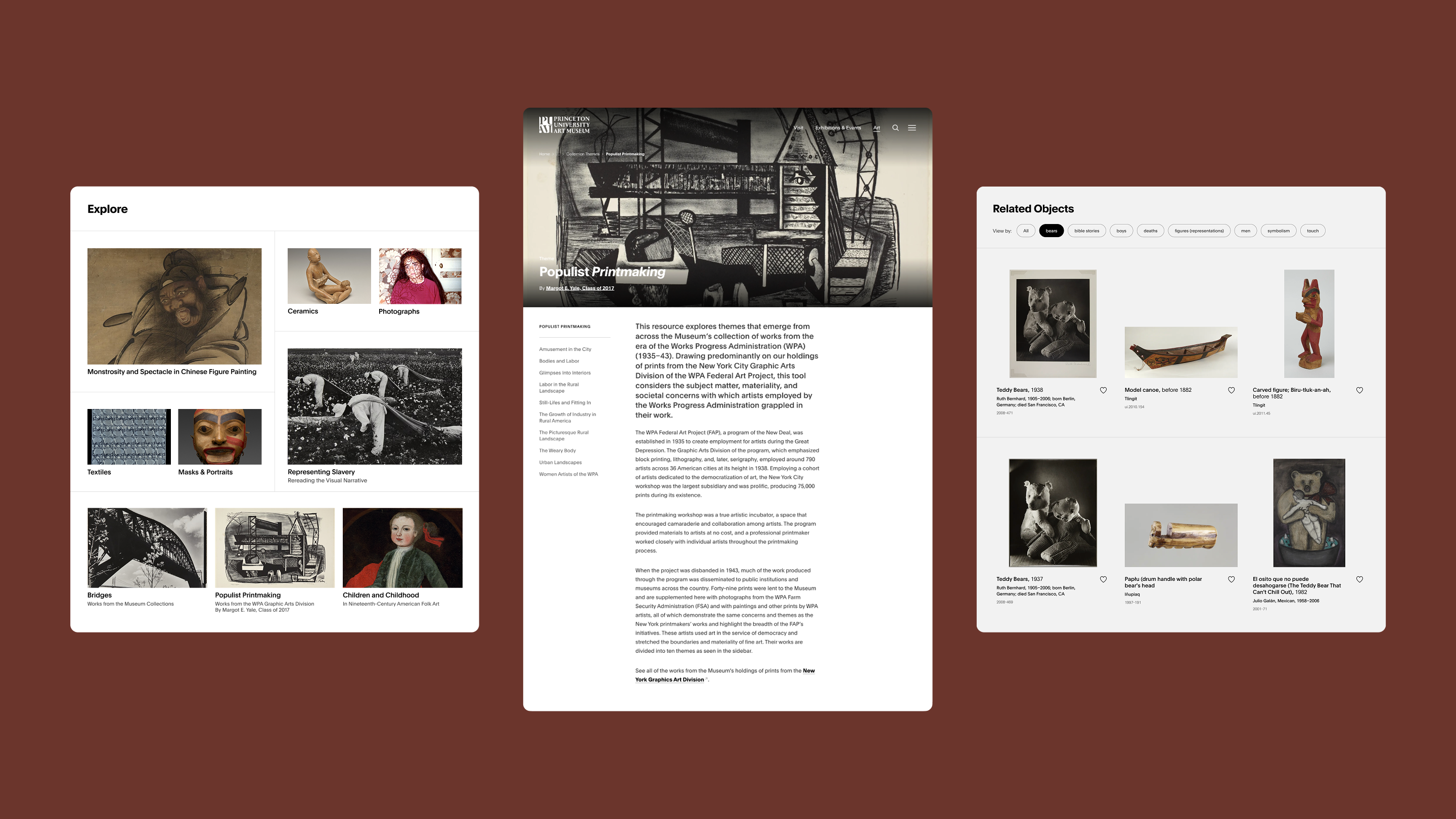
Helping users discover art
The site’s design is crafted to support self-guided discovery through intuitive, user-centered exploration paths. Rich, connected content, such as related objects, videos, and articles, encourages visitors to follow their curiosity and explore 50,000 years of art in an engaging, seamless way.

Users first
Optimized for mobile as well as desktop, the site was designed to be intuitive and accessible from any device. A reorganized information architecture, clear navigation, and inclusive language make it easy for all audiences to explore.
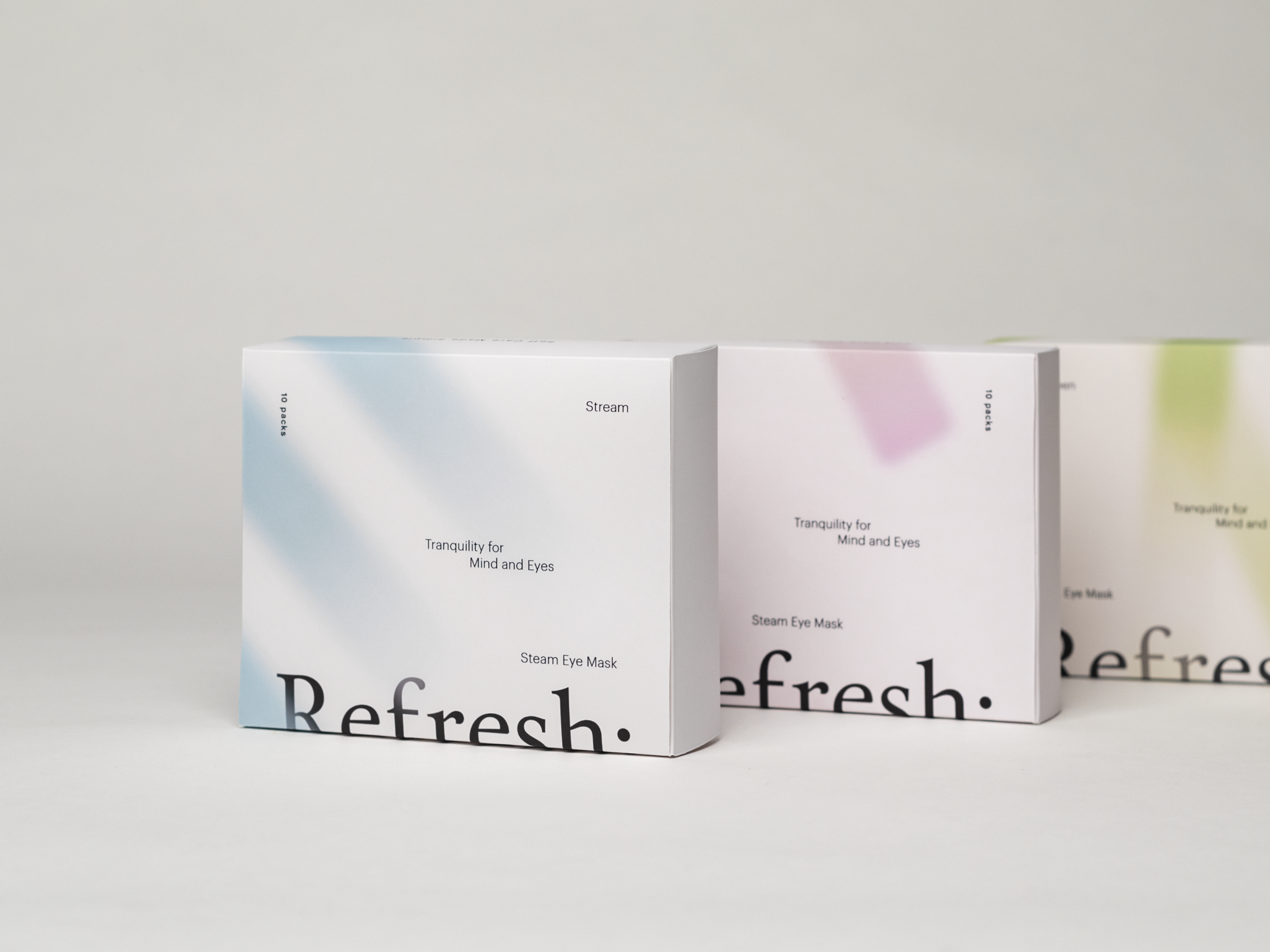
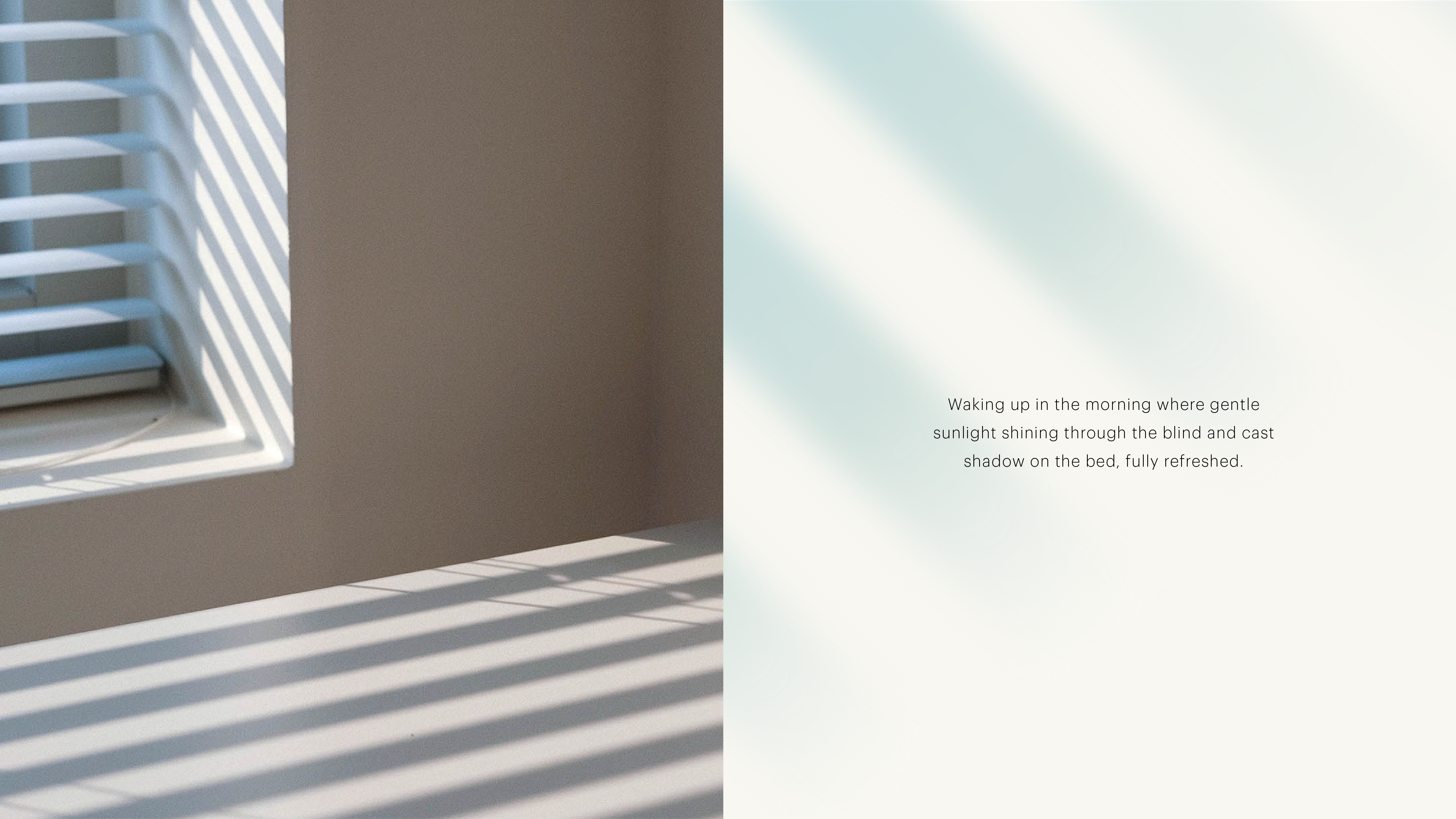
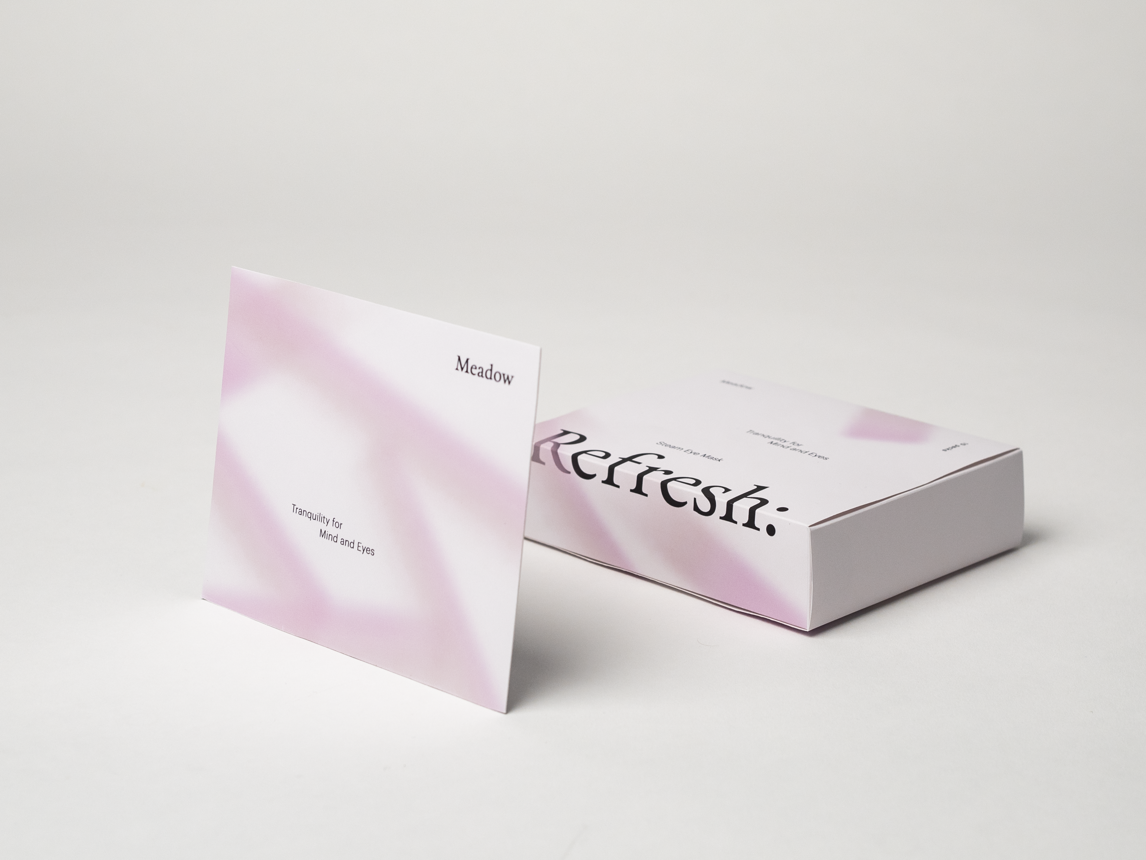
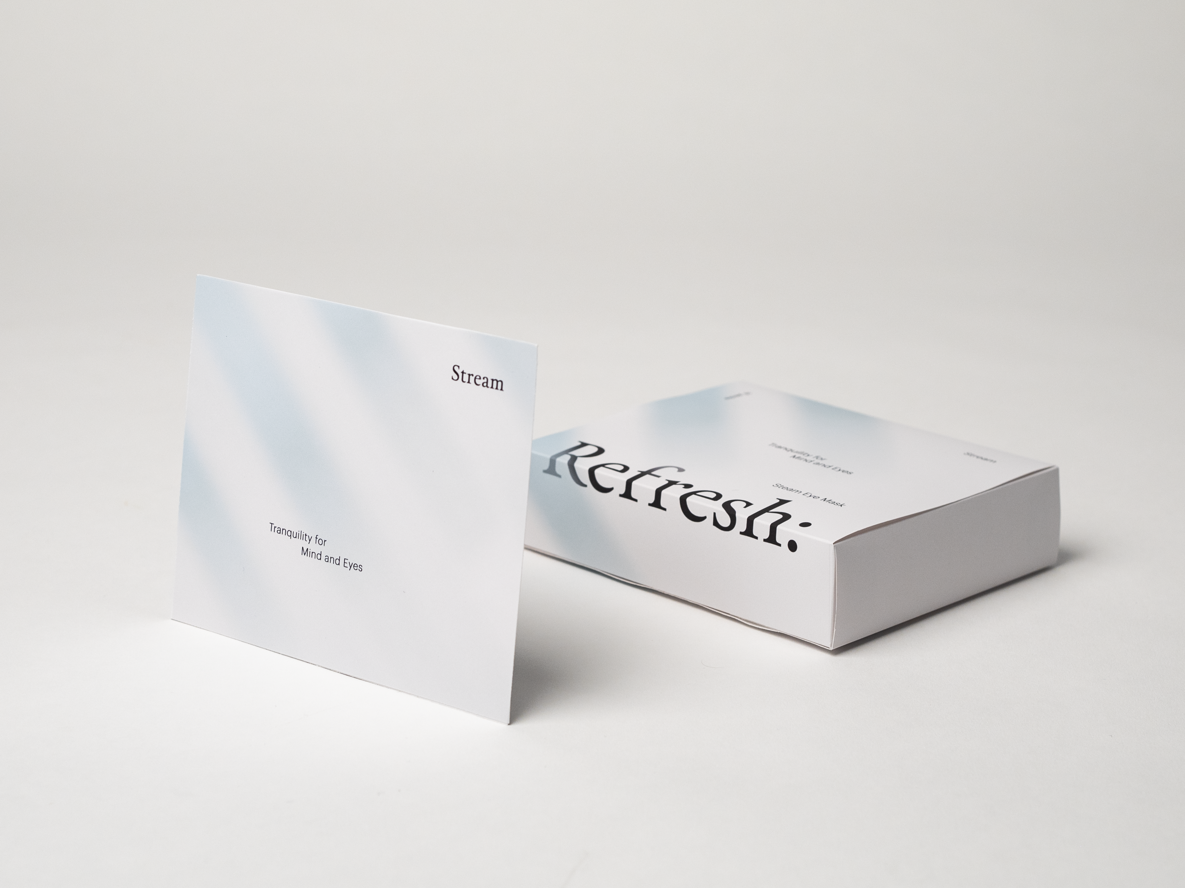
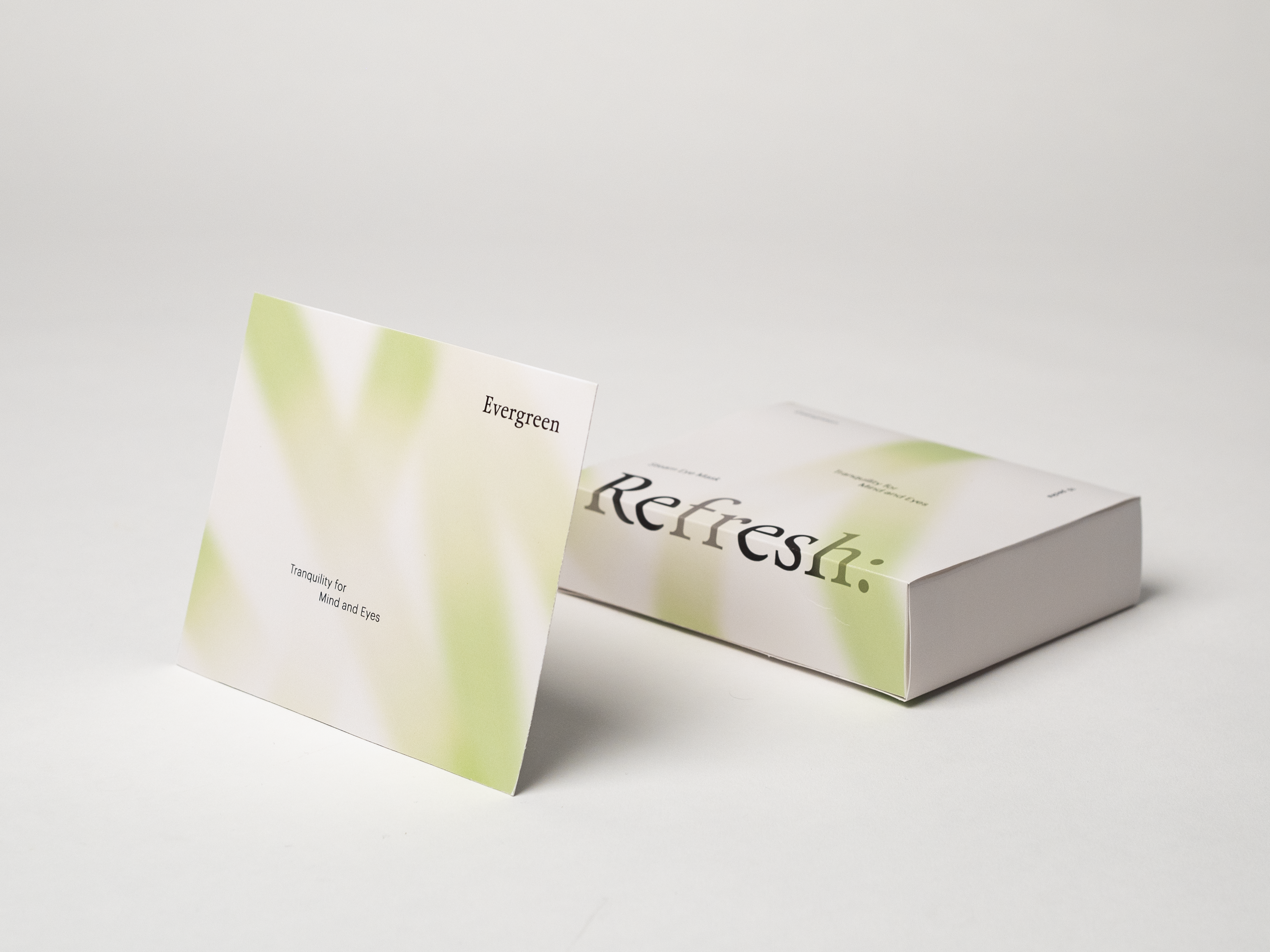
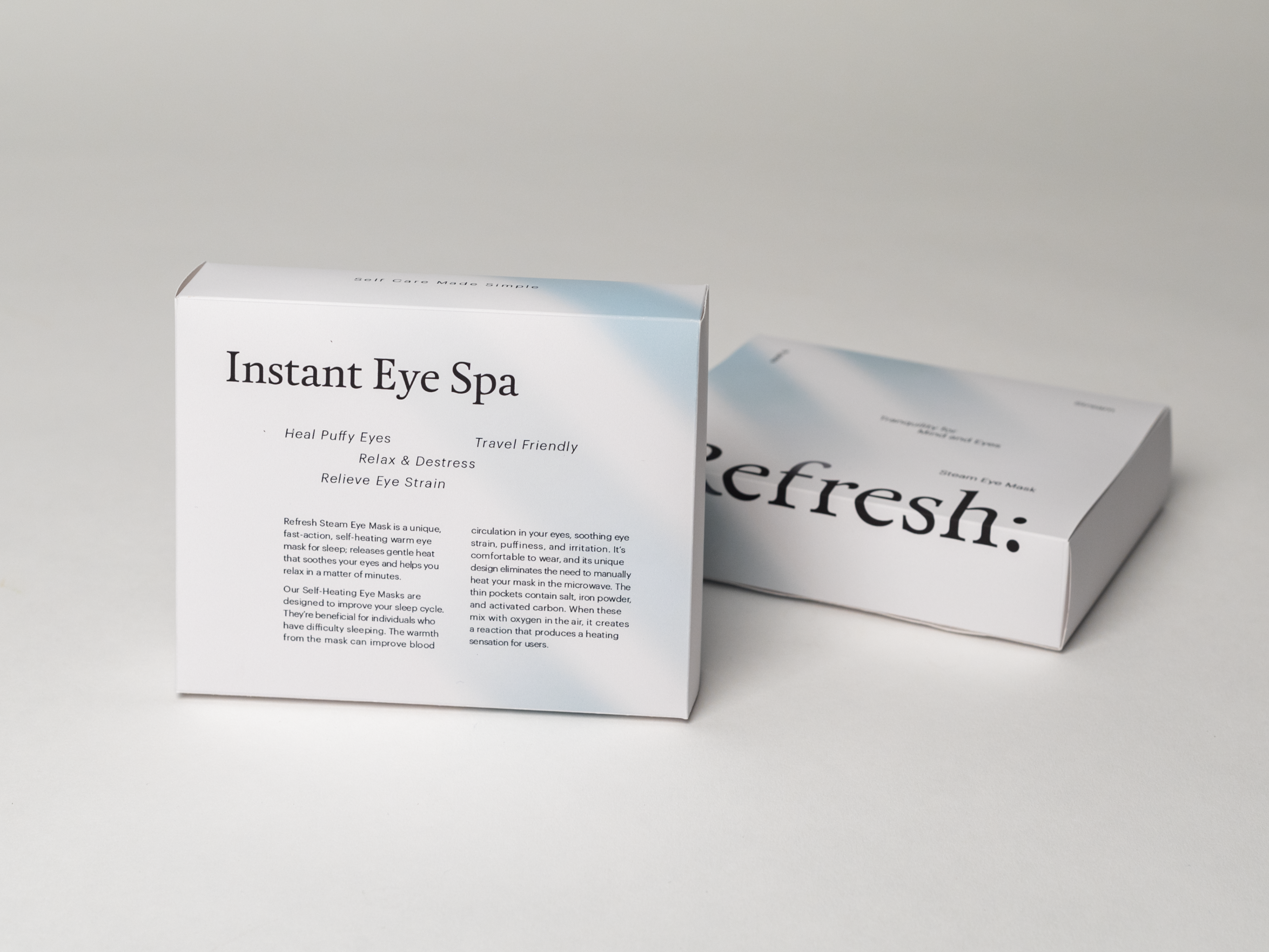
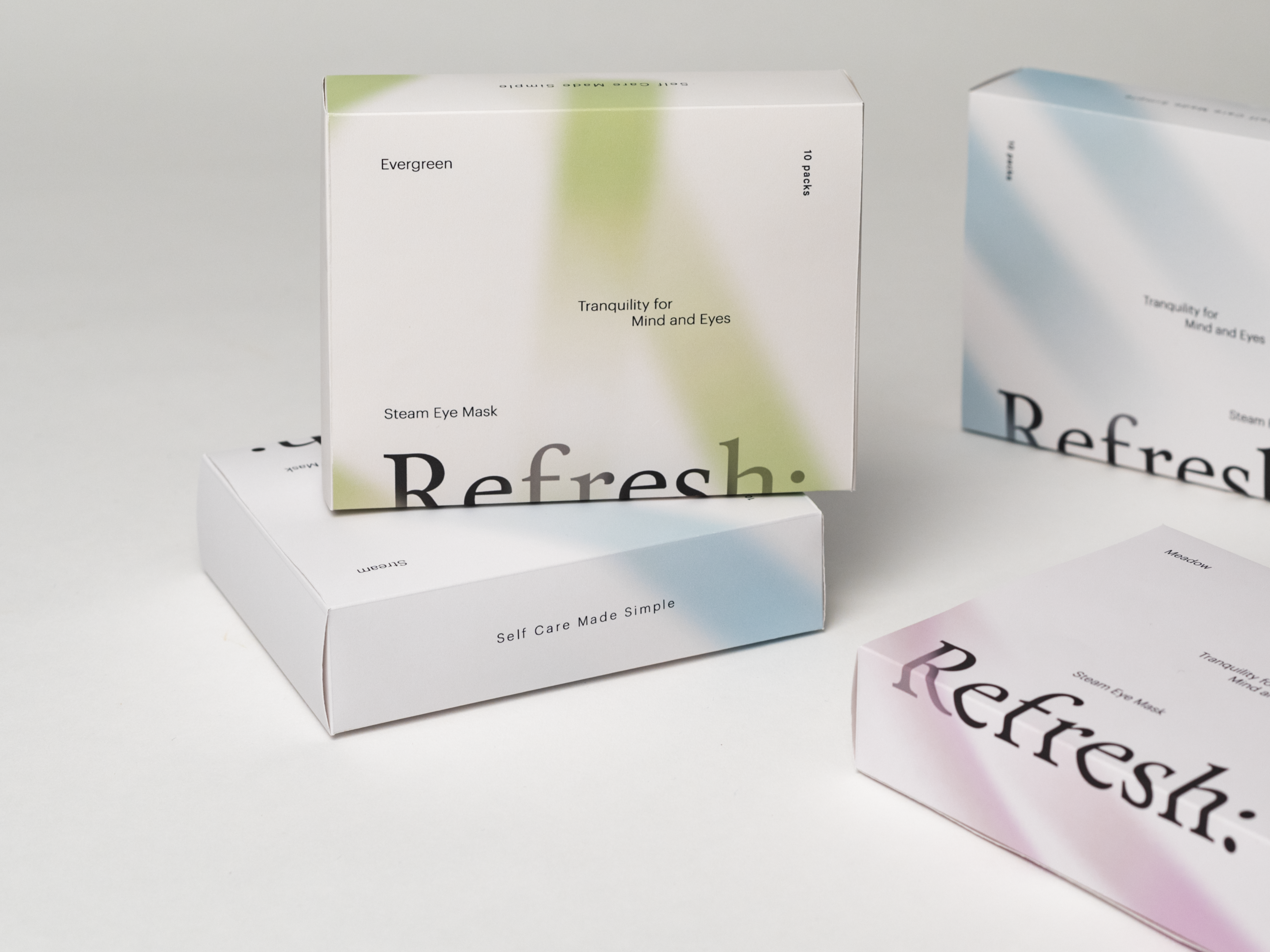
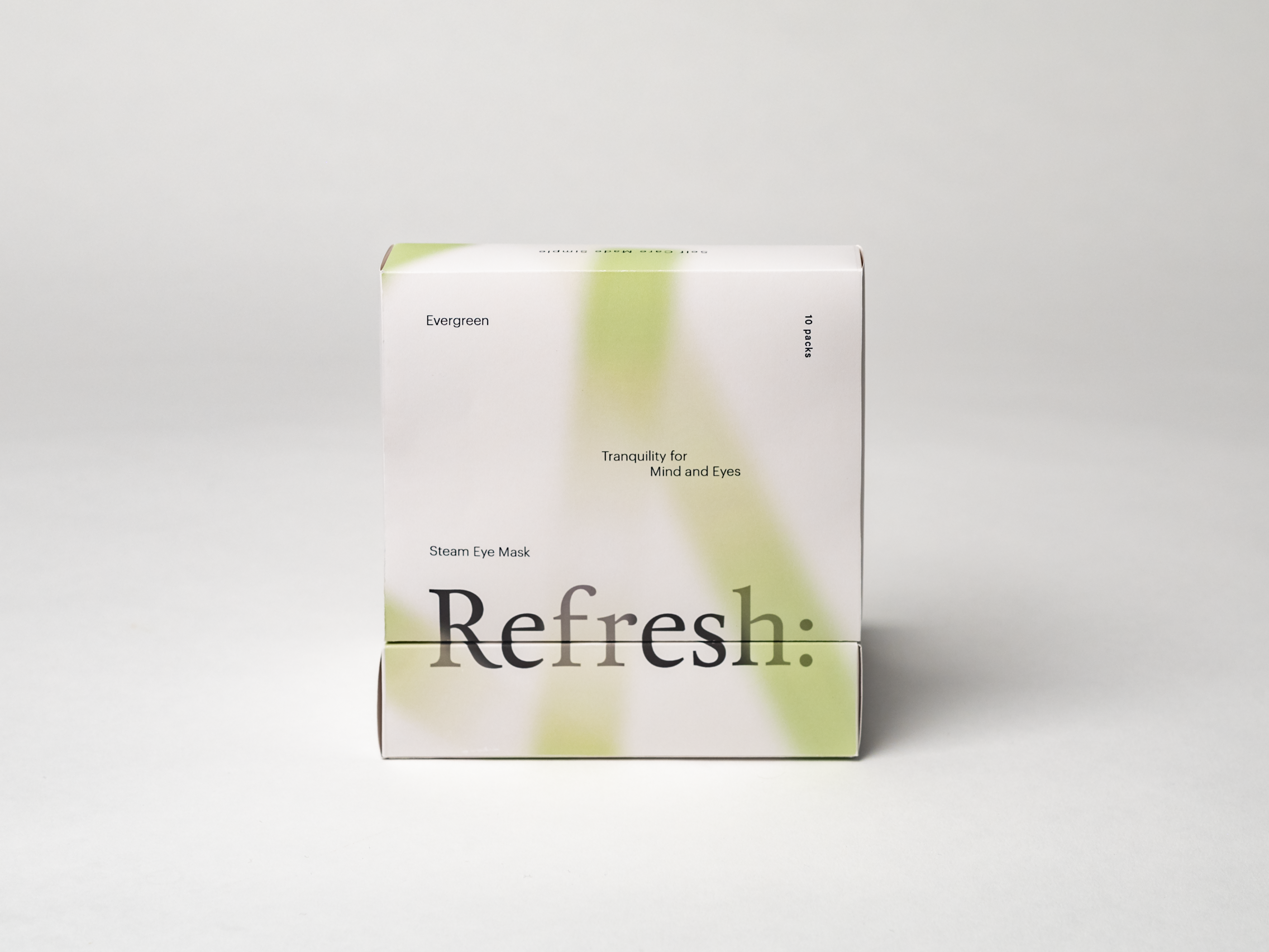
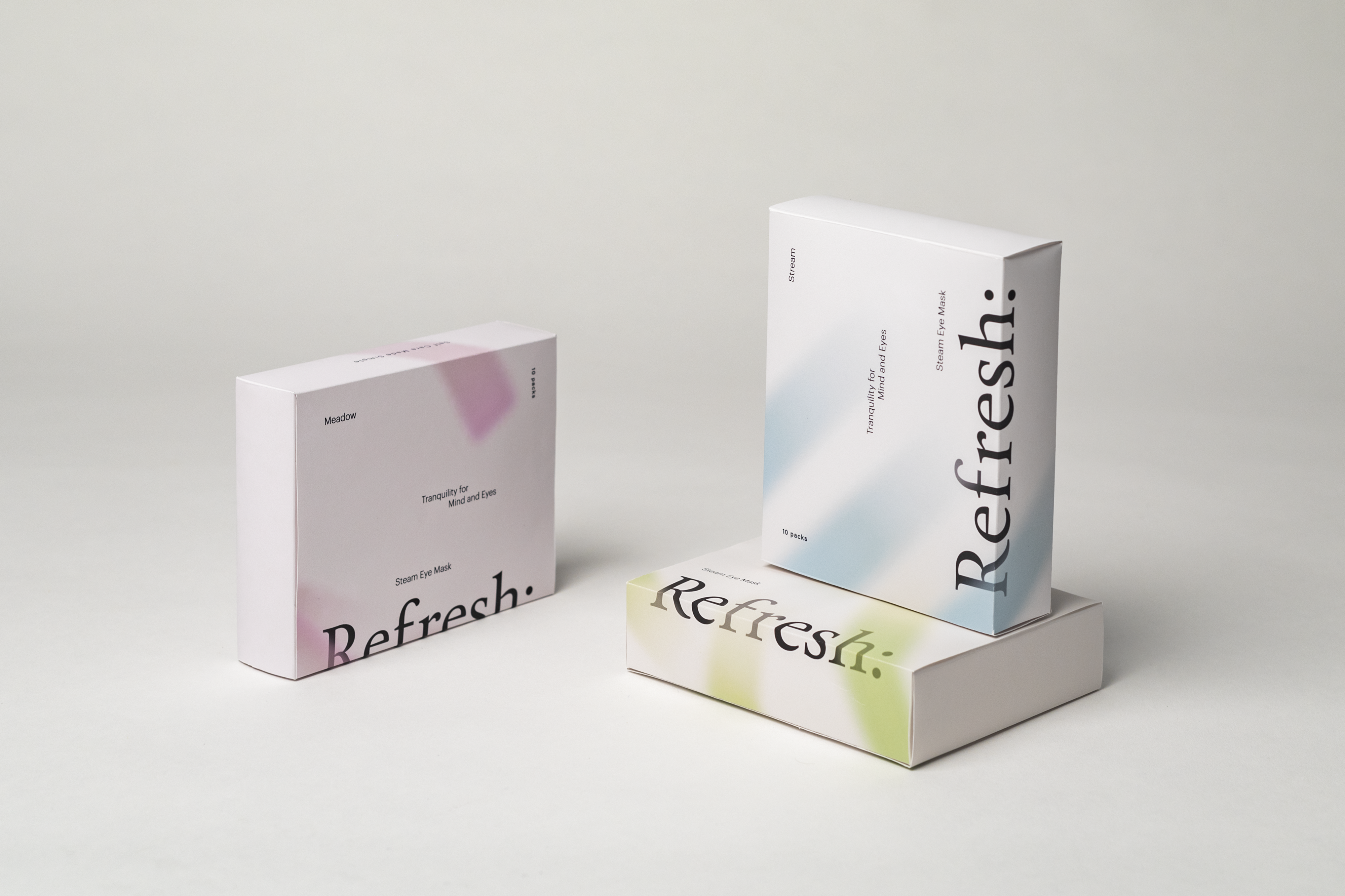
Refresh
Repackaging for Refresh steam eye masks series. The previous packaging with a solid dark color failed to convey the rejuvenating effects of the product. The new packaging, however, uses a steamy gradient and floating typography to create a vivid visual analogy of the soothing and heating sensation of the masks. This design effectively captures the soft and relaxing experience of using the product, providing a more engaging and interesting representation of the Refresh steam eye masks.
2022
Visual Identity
Packaging
Advisor
Jennifer Cole Phillips
Visual Identity
Packaging
Advisor
Jennifer Cole Phillips
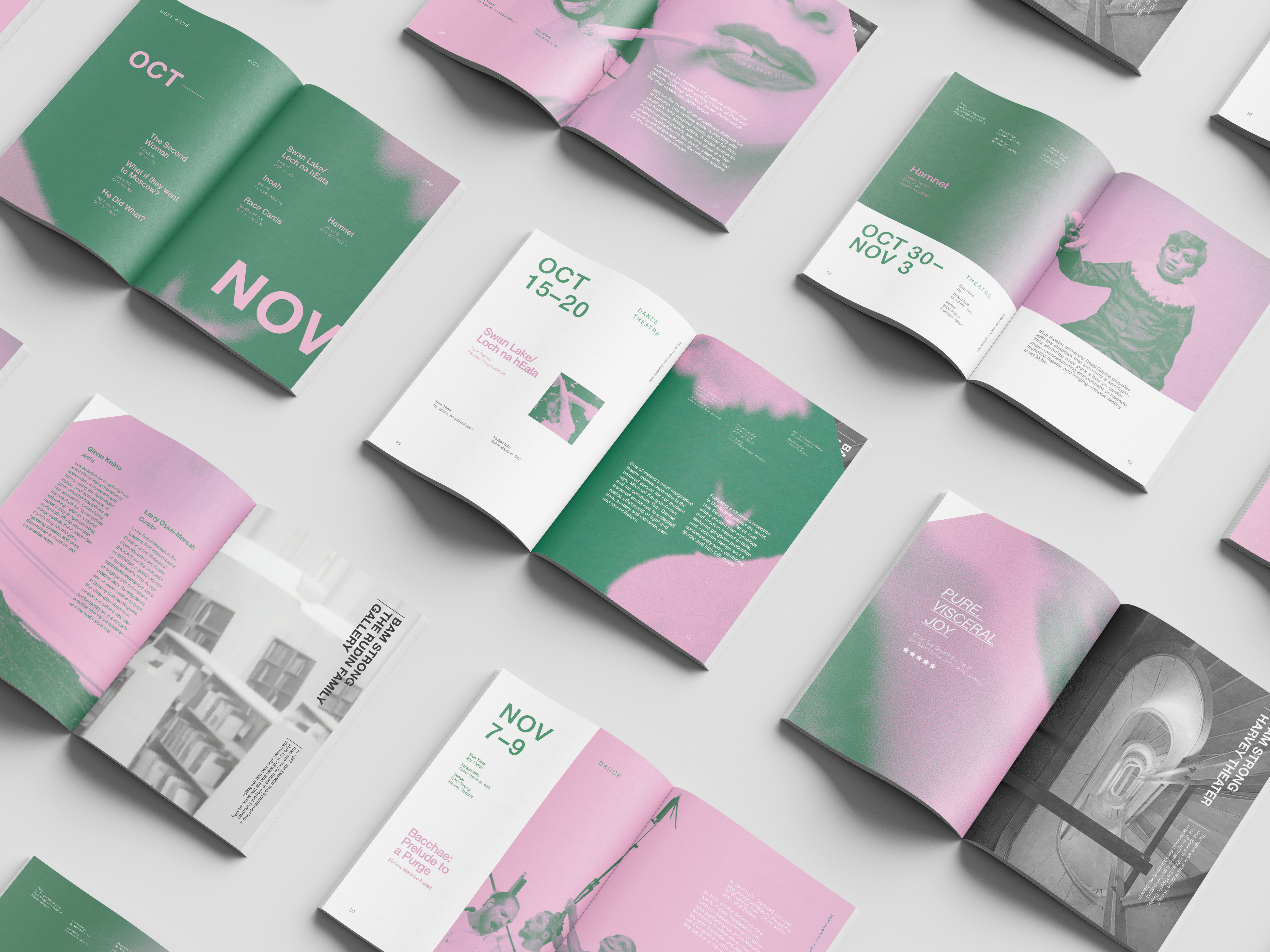
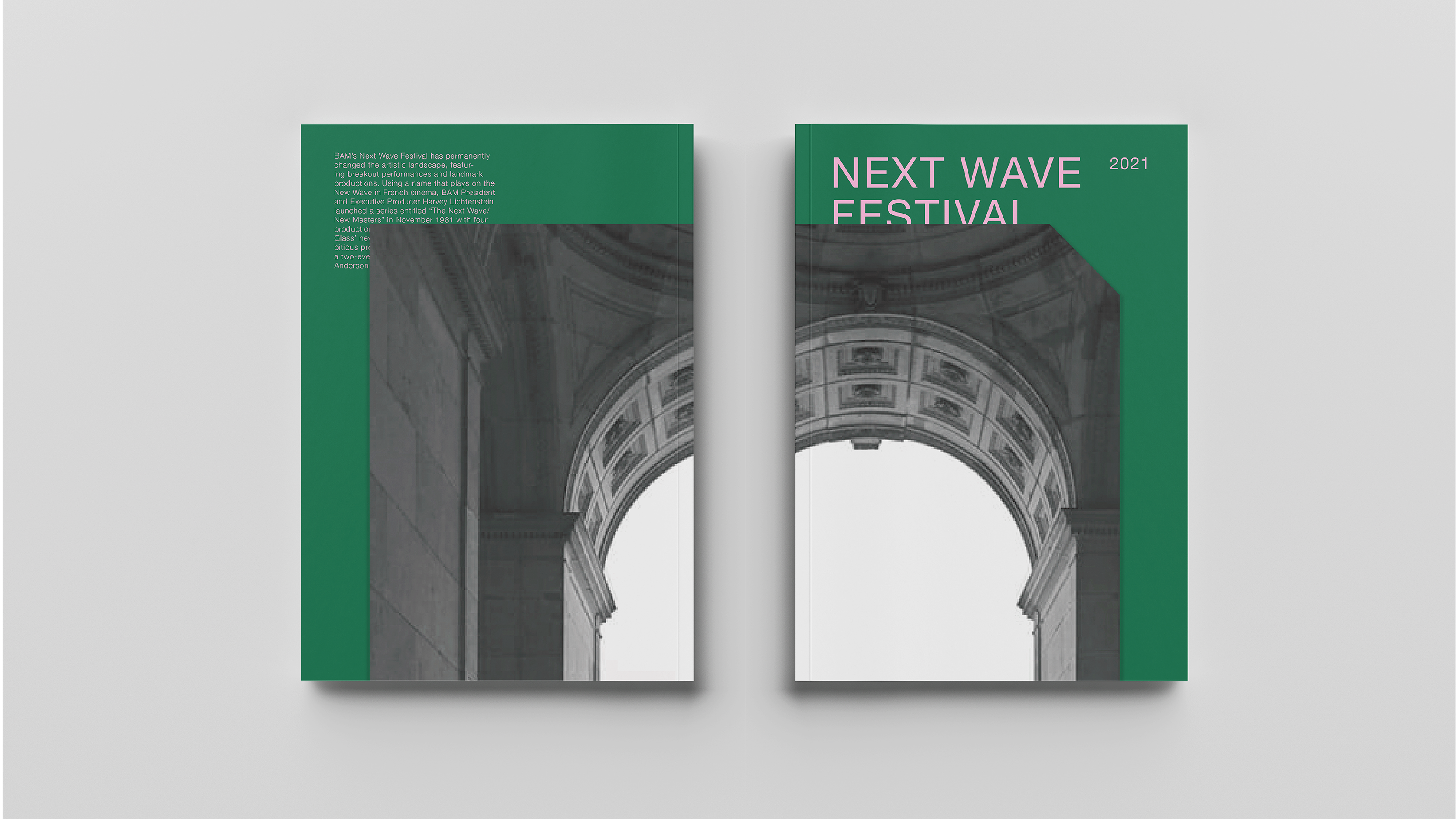
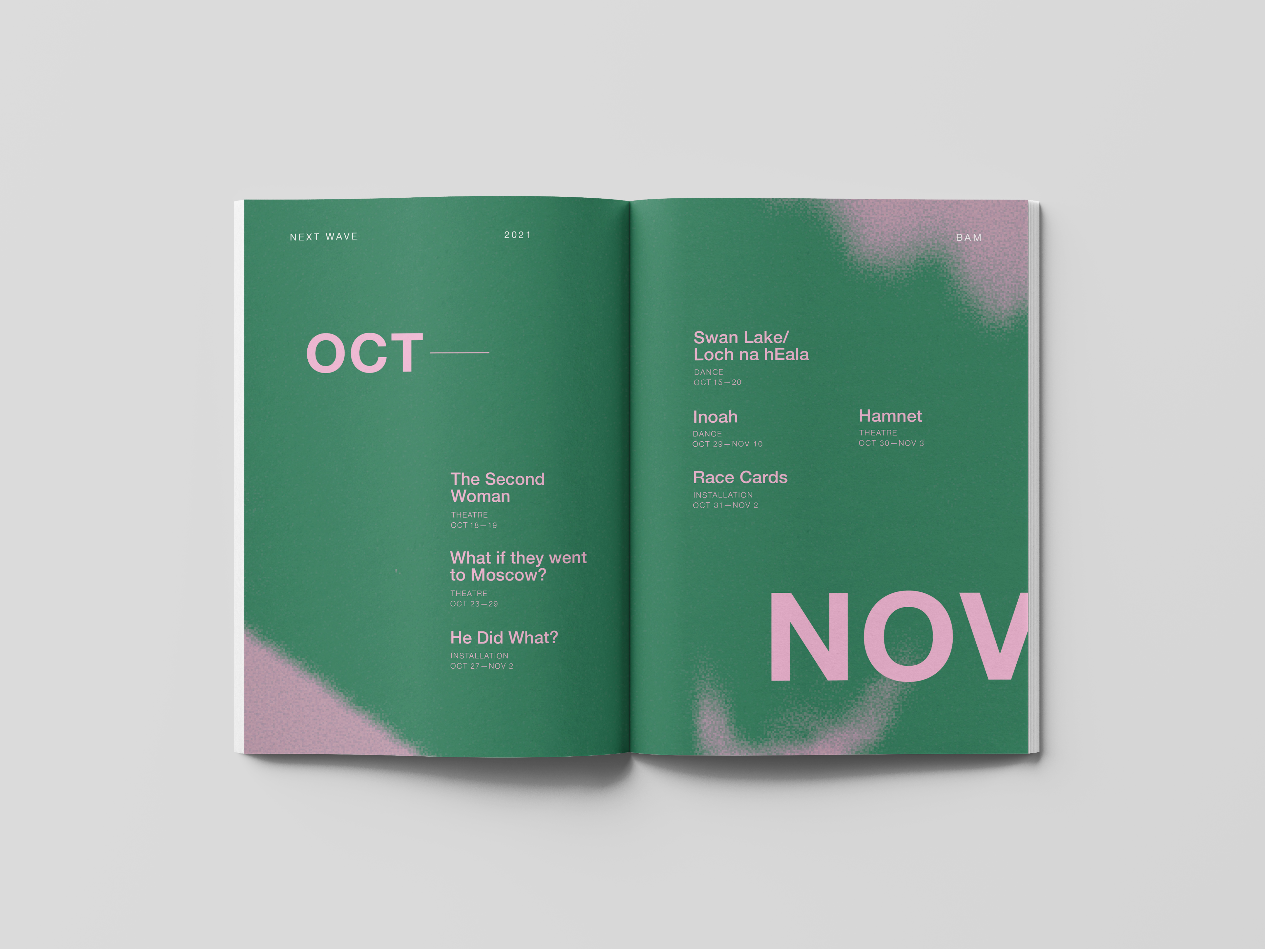
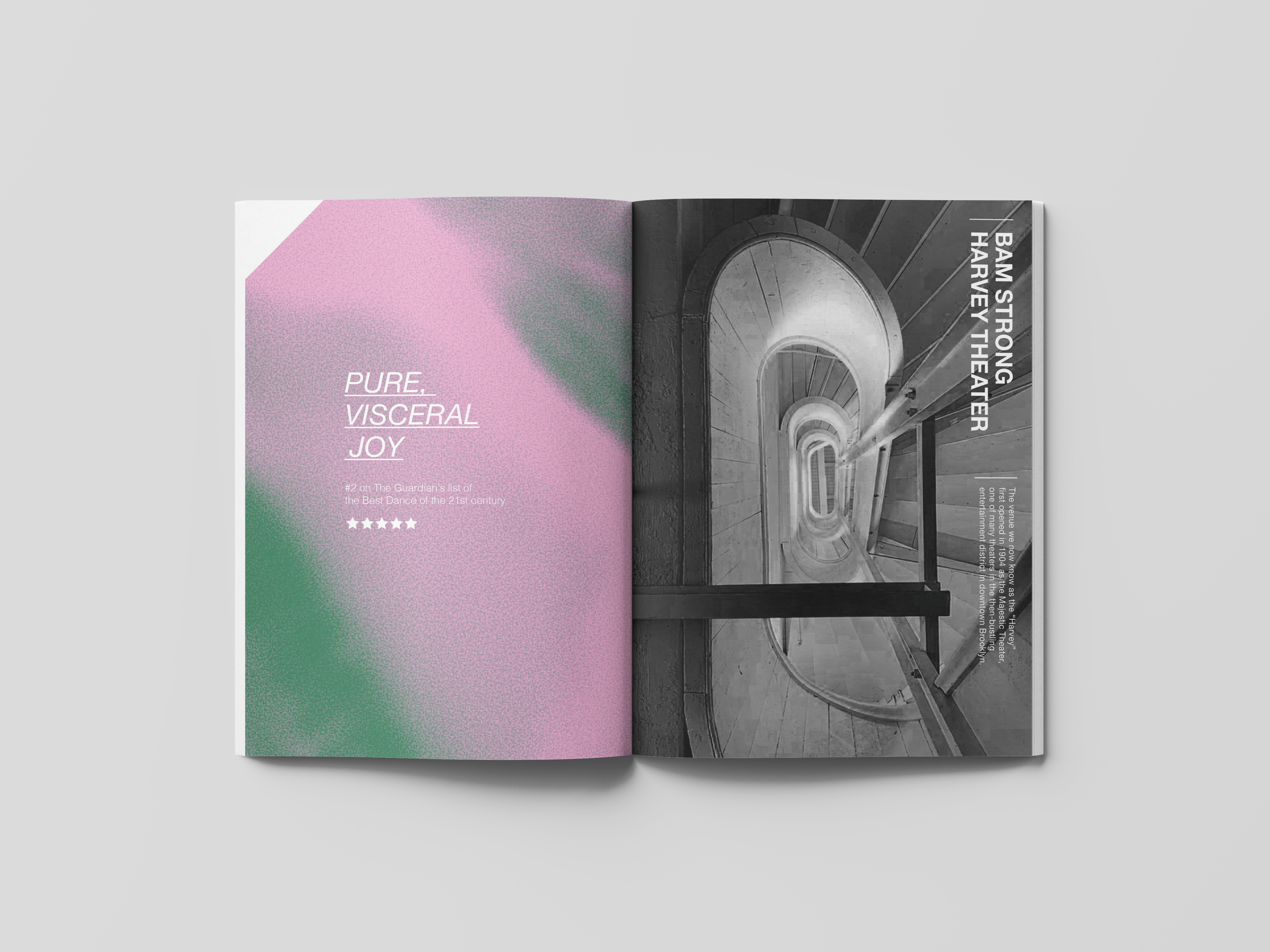
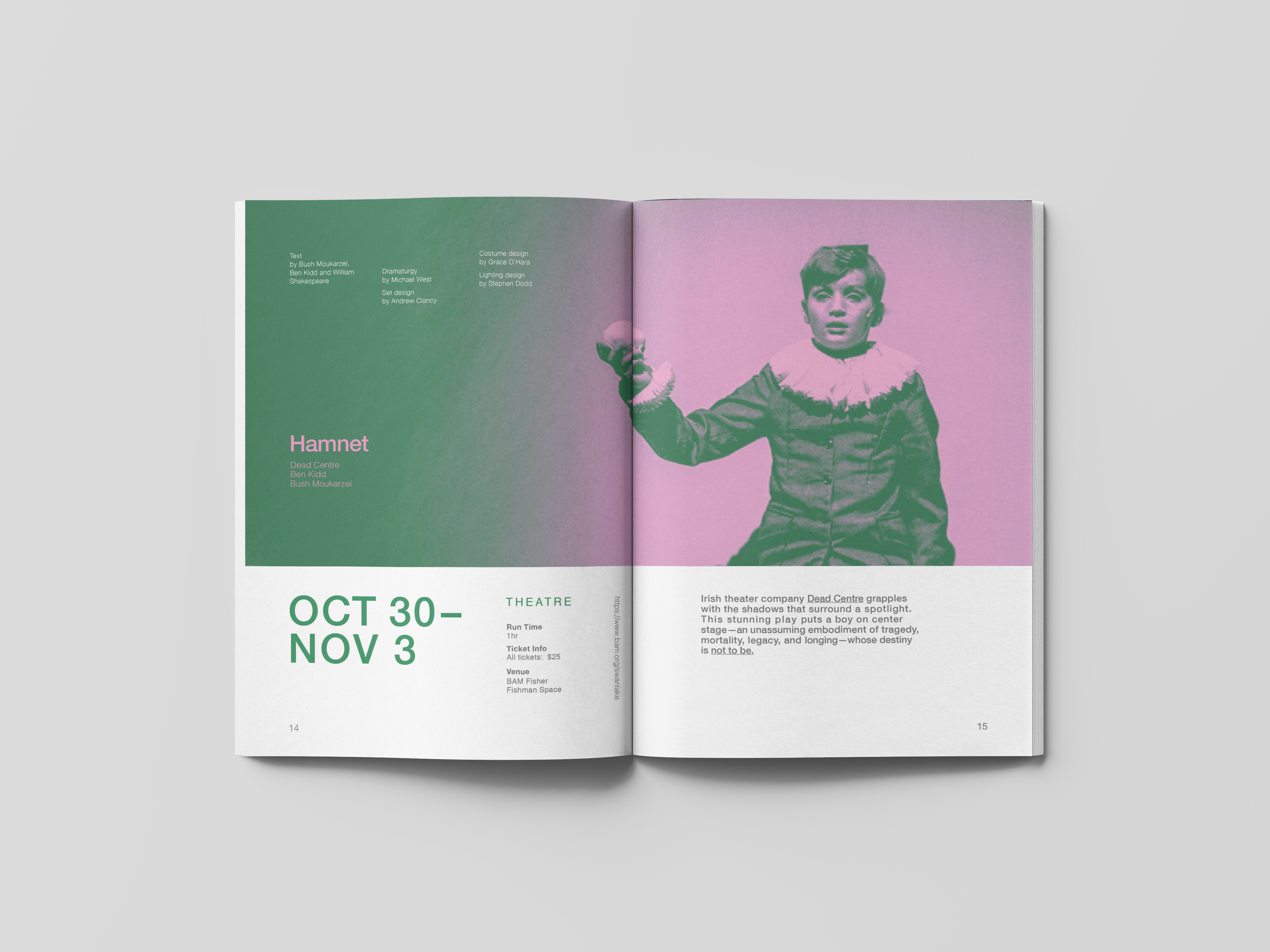
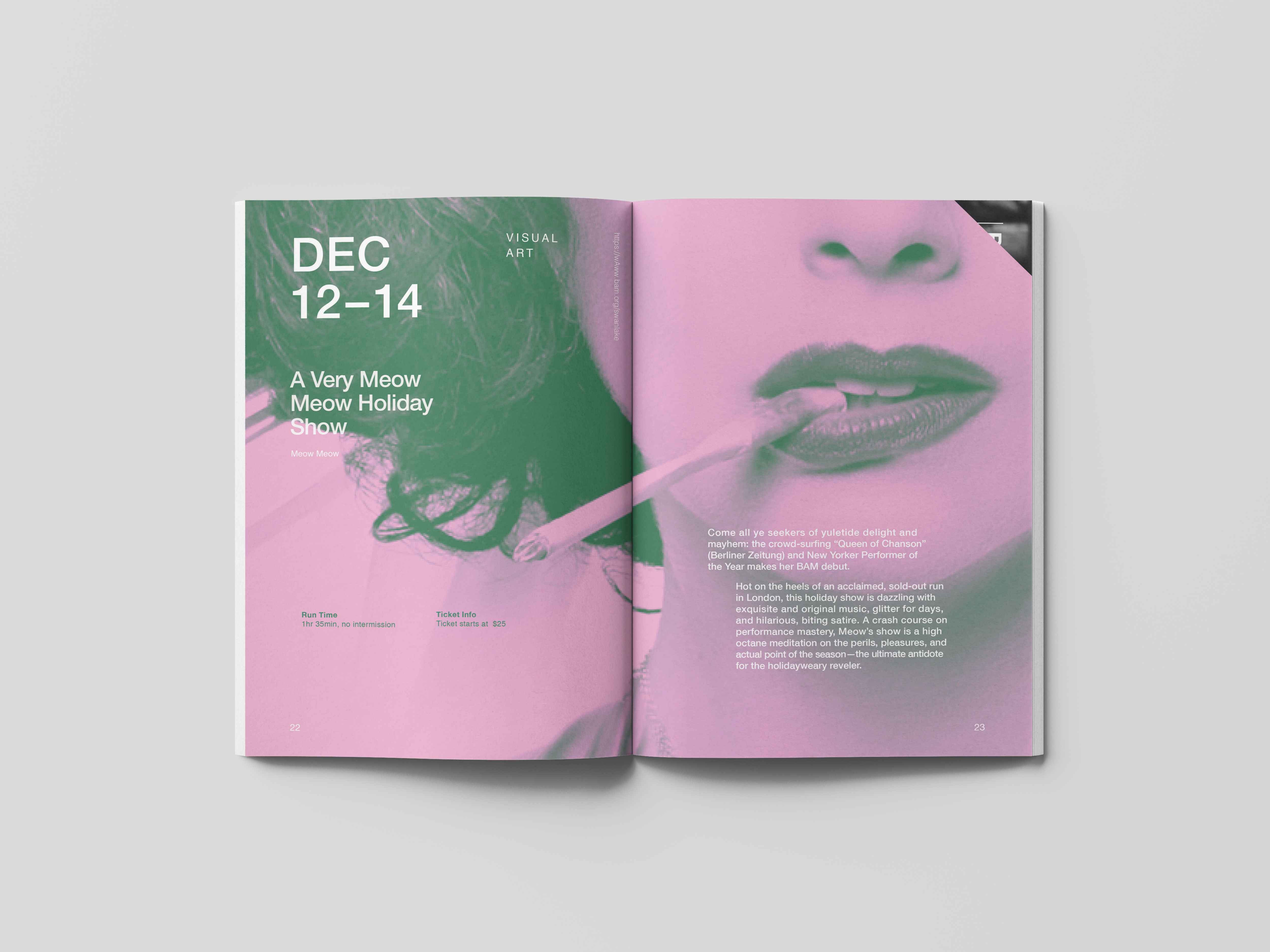
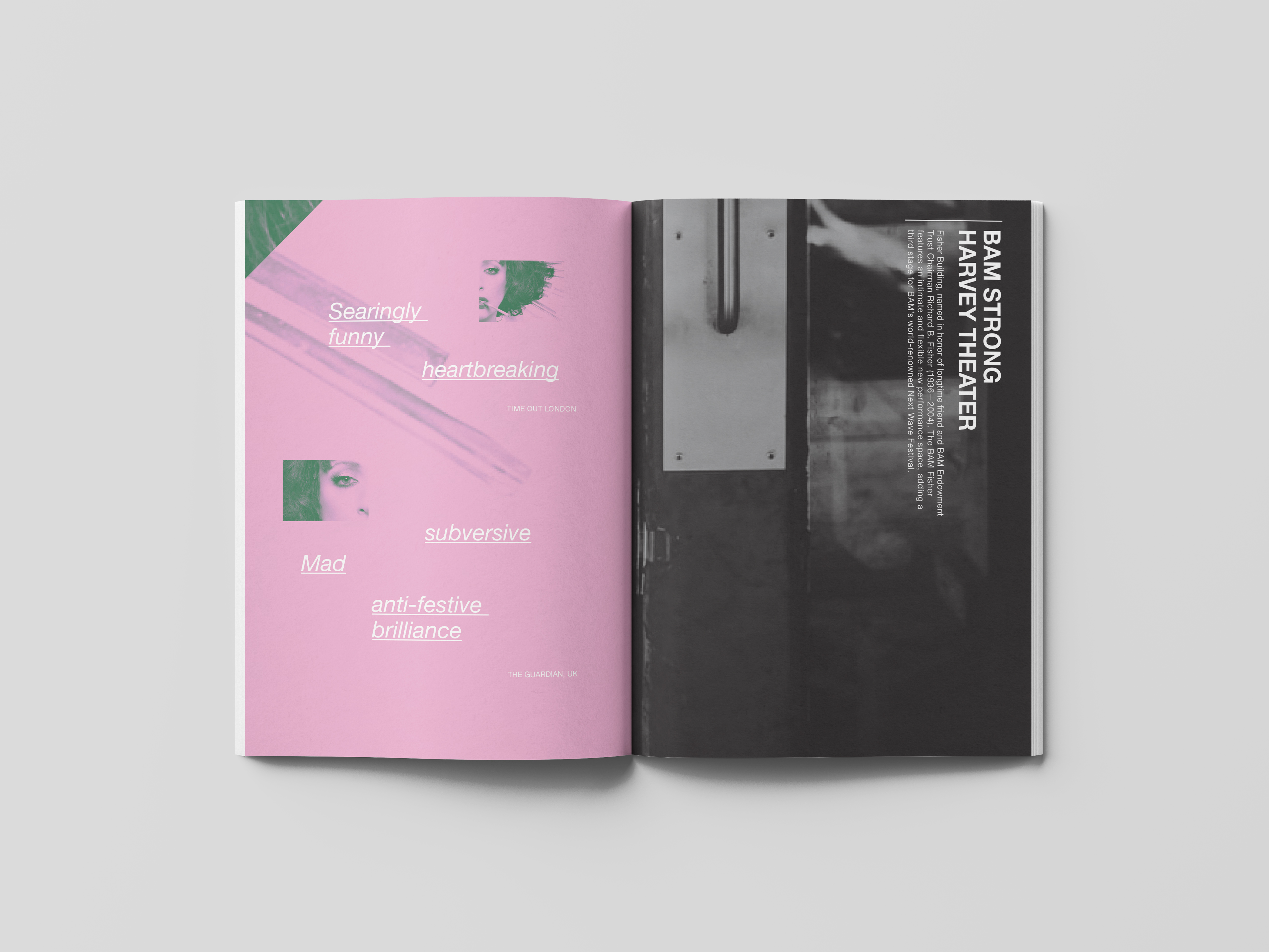
The Next Wave Festival
This program for The Next Wave Festival, a signature production of The Brooklyn Academy of Music (BAM), features a multi-tiered typographic hierarchy, using nuanced signals of separation to direct the reader through the content. Historic black & white photographs, juxtaposed with leading edge event imagery, denote the past and present while celebrating BAM’s long legacy of artistic and cultural contribution.
2020
Publication Design
Typography
Advisor
Jennifer Cole Phillips
Recognition
Indigo Design Awards 2022, Gold Winner︎︎︎
STA 100 2021, Winner︎︎︎
AIGA Flux Competition 2021, Winner︎︎︎
Publication Design
Typography
Advisor
Jennifer Cole Phillips
Recognition
Indigo Design Awards 2022, Gold Winner︎︎︎
STA 100 2021, Winner︎︎︎
AIGA Flux Competition 2021, Winner︎︎︎
Challenge
Design a brochure for Next Wave Festival 2021 to help audiences learn about the event and the organization.
Design a brochure for Next Wave Festival 2021 to help audiences learn about the event and the organization.
Solution
The main building of BAM is a classic theatre with a history of over 100 years, which forms an intriguing contrast with avant-garde and experimental shows that happen in it. The brochure captures the contrast by juxtaposing monochrome historical images and the performance still in fresh colors.
The main building of BAM is a classic theatre with a history of over 100 years, which forms an intriguing contrast with avant-garde and experimental shows that happen in it. The brochure captures the contrast by juxtaposing monochrome historical images and the performance still in fresh colors.

The up corner of the page is cut out to create a moment that coordinates the past and the present of BAM. The idea of cut-out corner and layering is also applied to cover design.


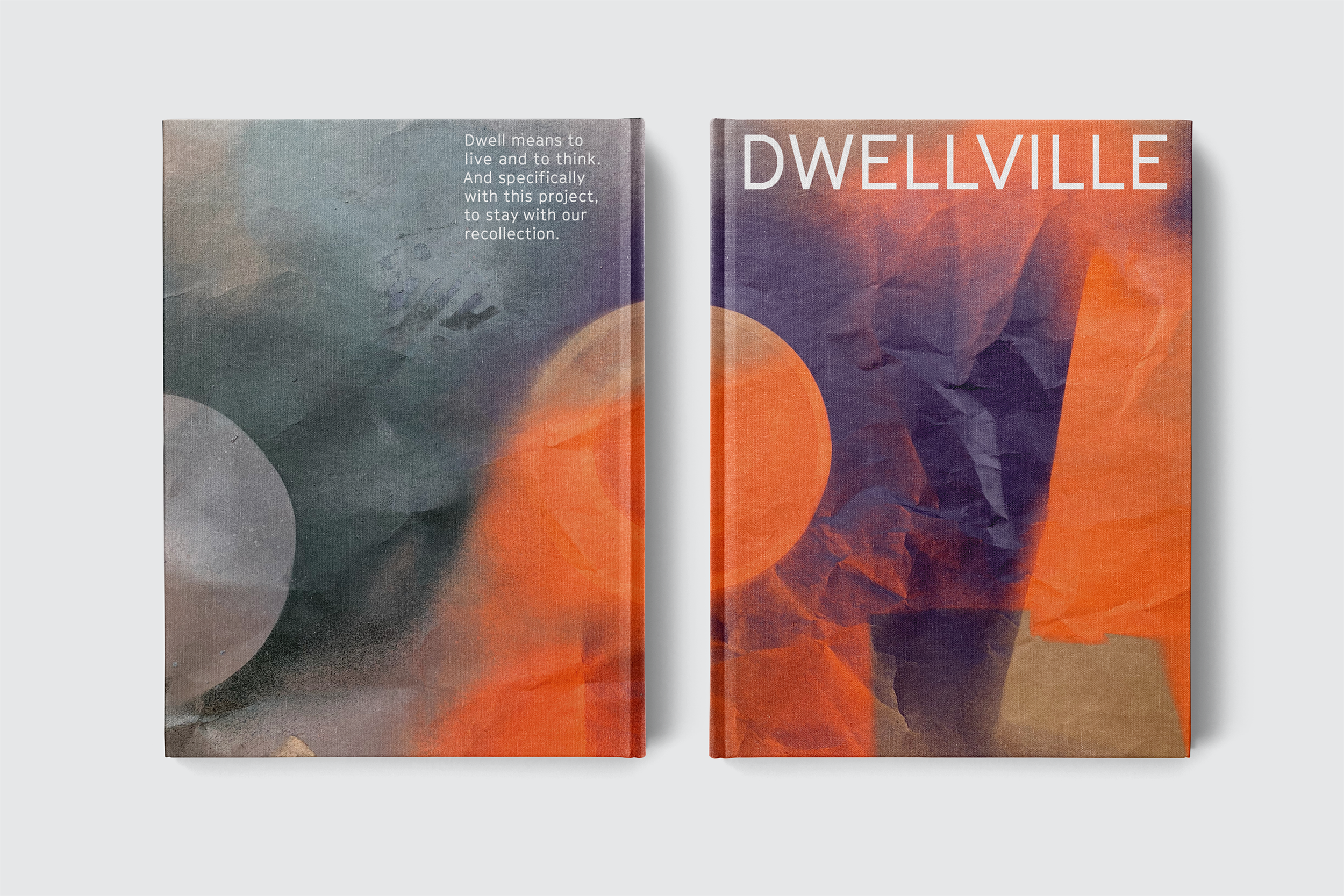
Dwellville
Dwellville, a village of emotional dwellings, is a series of visual forms accommodating intangible memories. These physical, touchable forms invite attention, connections, and interactions with our memories. The installation integrates real stories, graphics, and 3D shapes to show a process of visual interpretation. The project proposes a new mode of retrospection by exploring how to express our emotions graphically and spatially.
2022
Graduate Thesis
3D Motion
Typography
Publication
Digital Fabrication (3D Printing)
Exhibition Design
Advisor
Ellen Lupton
Jennifer Cole Phillips
Graduate Thesis
3D Motion
Typography
Publication
Digital Fabrication (3D Printing)
Exhibition Design
Advisor
Ellen Lupton
Jennifer Cole Phillips
PART 01 Exhibtion

To dwell means to live or to think. And specifically with this project, to stay with our recollections.


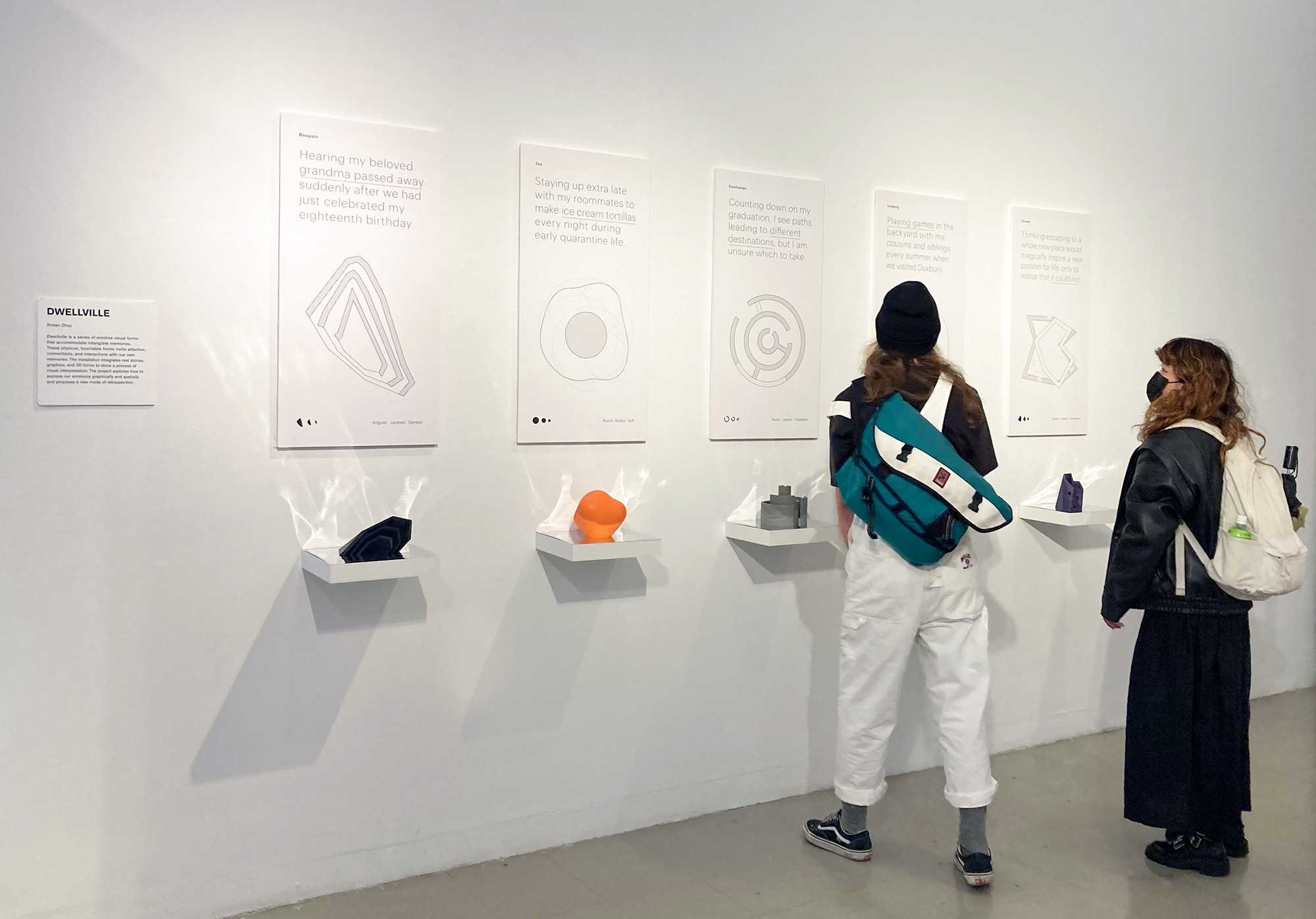
Dwellville is also a state of the coexistence between memories and their owner.
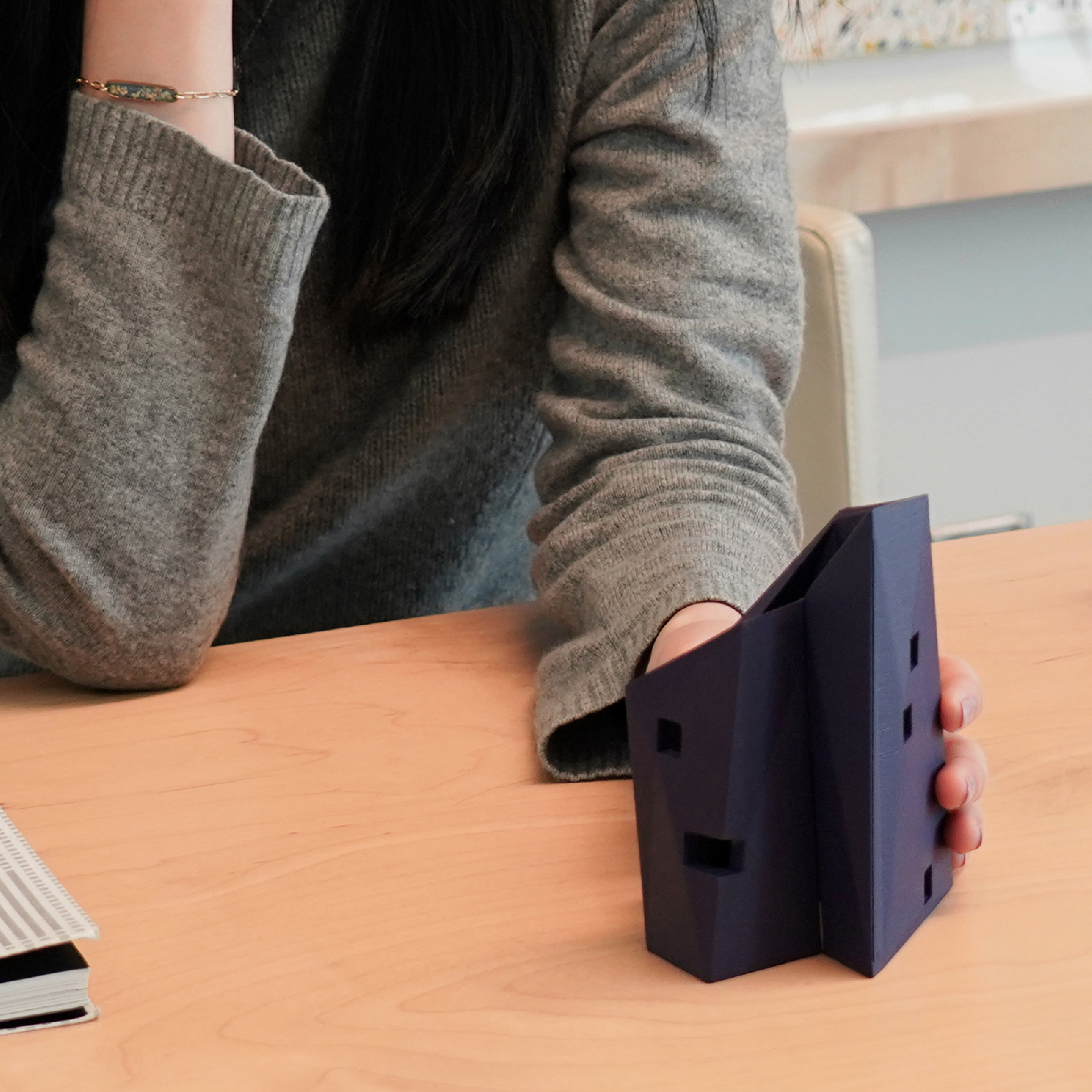

Part 02 3D Posters
The series of 3D posters illustrates the transition from floor plan to the dwellings.


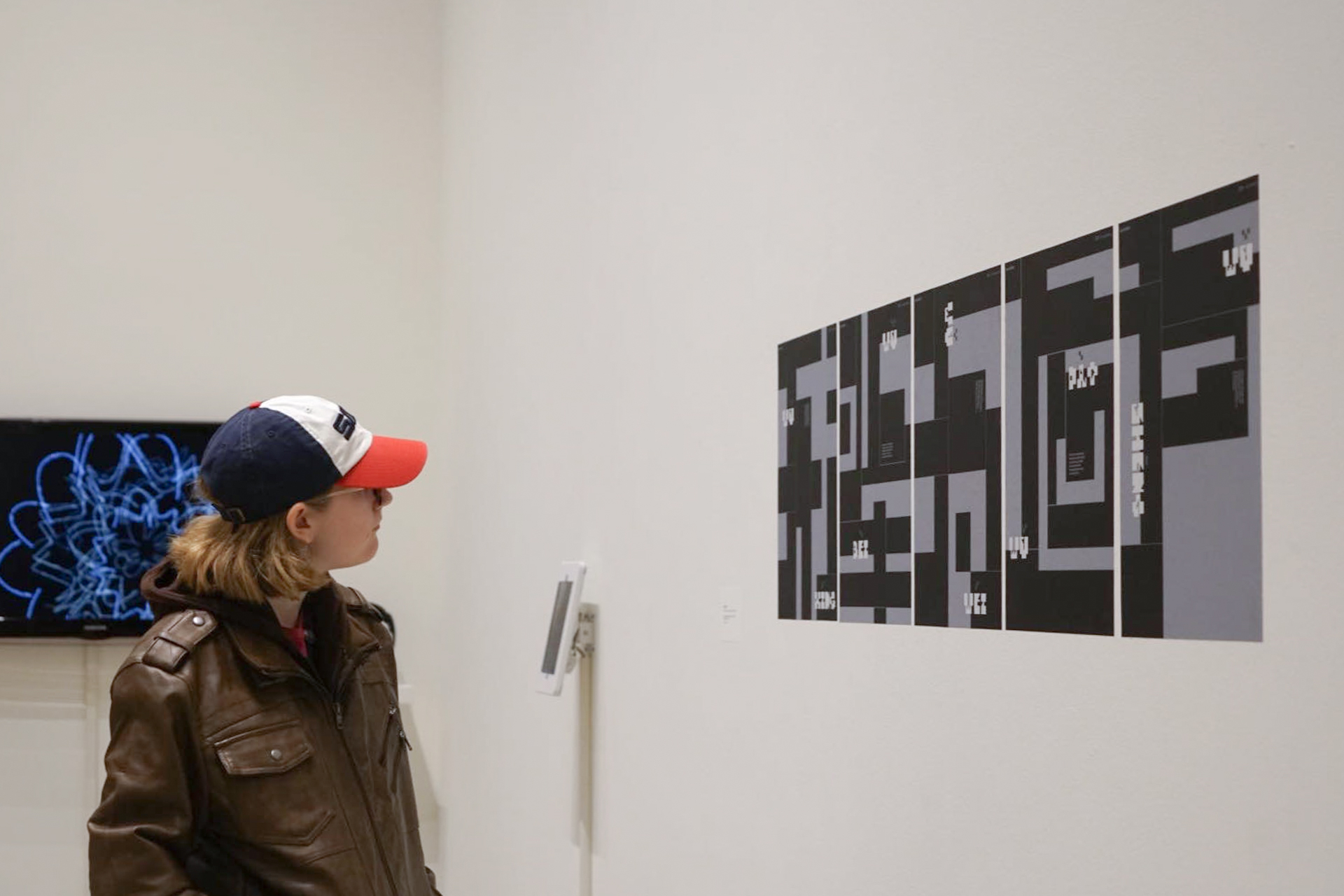
PART 03 Publication
This book is a documentation for the Dwellville project. The book is structured in an architect's view to echo the concept of space as a symbolic presentation of memories. It employs multi-tiered typography, architectural graphics, and emotional 3D forms to elaborate the process of thinking, making, and displaying the project.

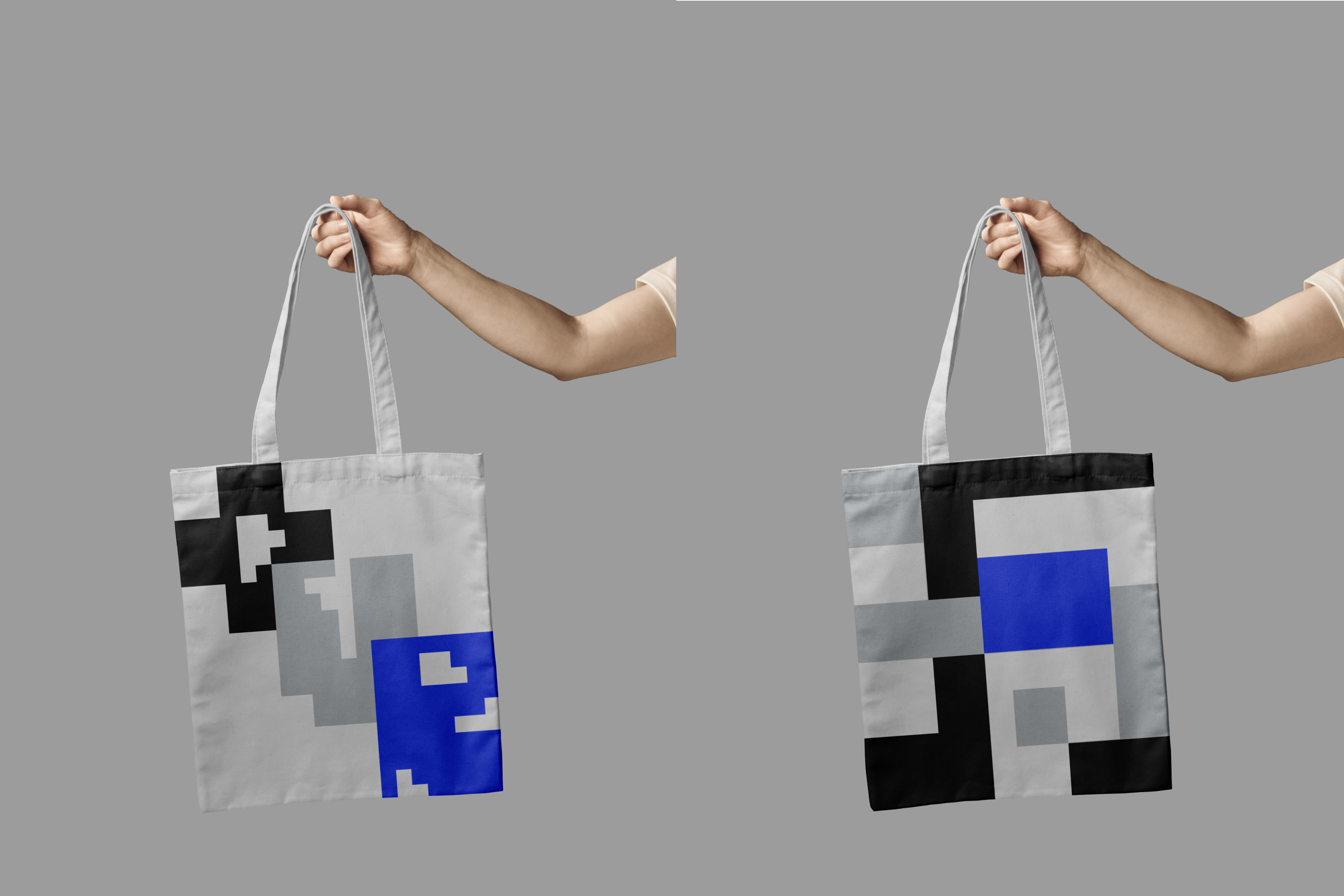
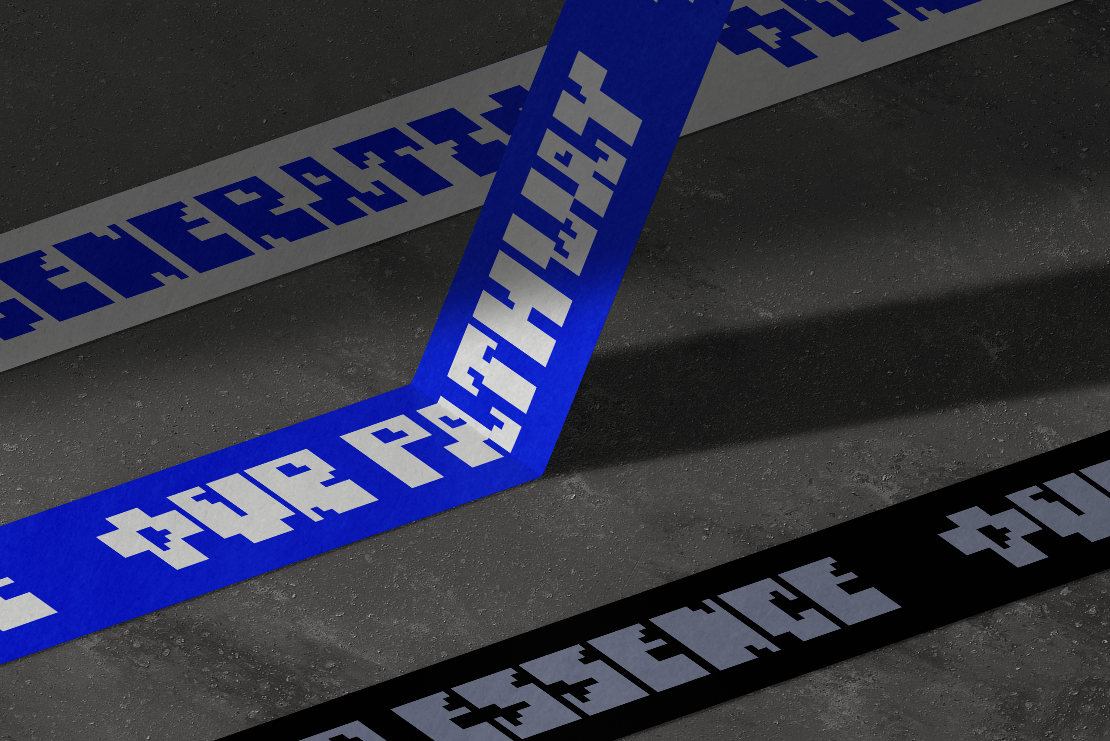
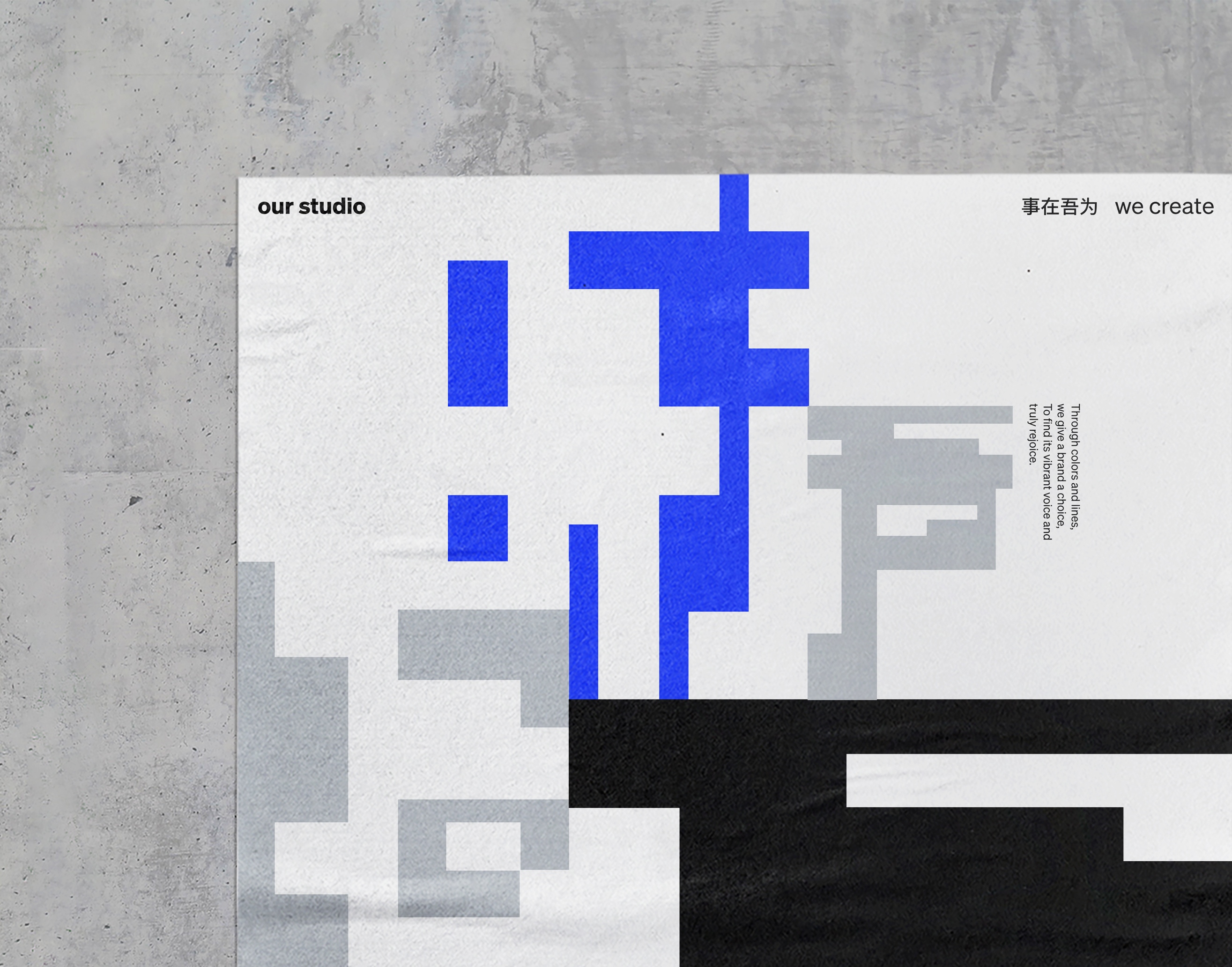
Our Studio Poster Series
This poster series embodies the essence of Our Studio – ‘From void to being, we create.’
Inspired by the unique structure of Hanzi characters– we view the square format as the bone, and the square block as the skin, creating a visual language that encapsulates possibilities and dynamic balance. We transform the Hanzi characters into shapes, reimagining a series of two-character words— “our creation, our shape, our voice, our generation, our pathway — into distinctive glyphs as the focal point in the posters.
2023
Poster, Typography
Team
Xinran Zhou, Art director & Designer
Shuang Wu, Art director & Designer
Yanjie Chen, Designer
Recogonition
Communication Arts 2024, Typography Winner︎︎︎
International Design Awards, Bronze Winner︎︎︎
Poster, Typography
Team
Xinran Zhou, Art director & Designer
Shuang Wu, Art director & Designer
Yanjie Chen, Designer
Recogonition
Communication Arts 2024, Typography Winner︎︎︎
International Design Awards, Bronze Winner︎︎︎
Our Poster The Basic Series

 Featured in 2024 Kansas City Biennial Show at H&R Block Art Space

Our Poster The Trio Series


Our Brand