Typolyrics
A series of typographic album covers in black and white. The series interprets the songs’ tenor, moods and sonic quality into dynamic visual stories while delving into the relationship between music and typography in Chinese, Korean, and English.
2020
Album Covers
Typography
Advisor
Jennifer Cole Phillips
Album Covers
Typography
Advisor
Jennifer Cole Phillips


春光乍泄/Happy Together : A throbbing and profoundly nostalgic lament for an obscure love story


괜찮아도 괜찮아/That’s Okay : A soothing acoustic song with a textural voice about everyday life

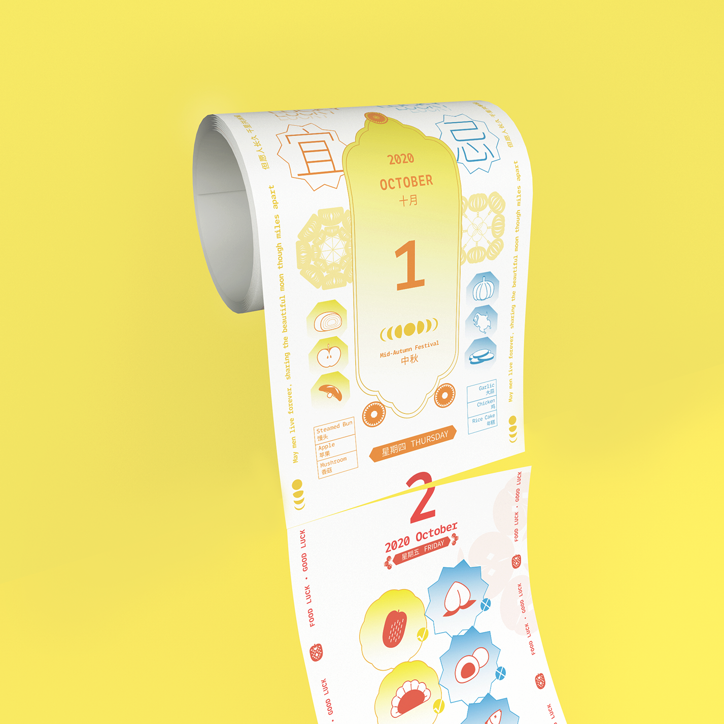
FoodLuck Calendar
FoodLuck Calendar is based on an imagined persona as an indecisive and superstitious food lover. Inspired by superstition in Cantonese food culture and Huang Calendar, the traditional Chinese calendar indicating the dos and don’ts for each day, I created this calendar to find the daily lucky food.
The design integrates traditional patterns, papercuts, and colors from Cantonese culture. It balances the classic vernacular Cantonese aesthetic and a modern international style through a combination of literal illustrations of foods and the papercut patterns that are transformed from them. The calendar is printed out in a paper roll to indicate the ongoing time.
2020
Bilingual Design
UI Design
Advisor
Jennifer Cole Phillips
Bilingual Design
UI Design
Advisor
Jennifer Cole Phillips


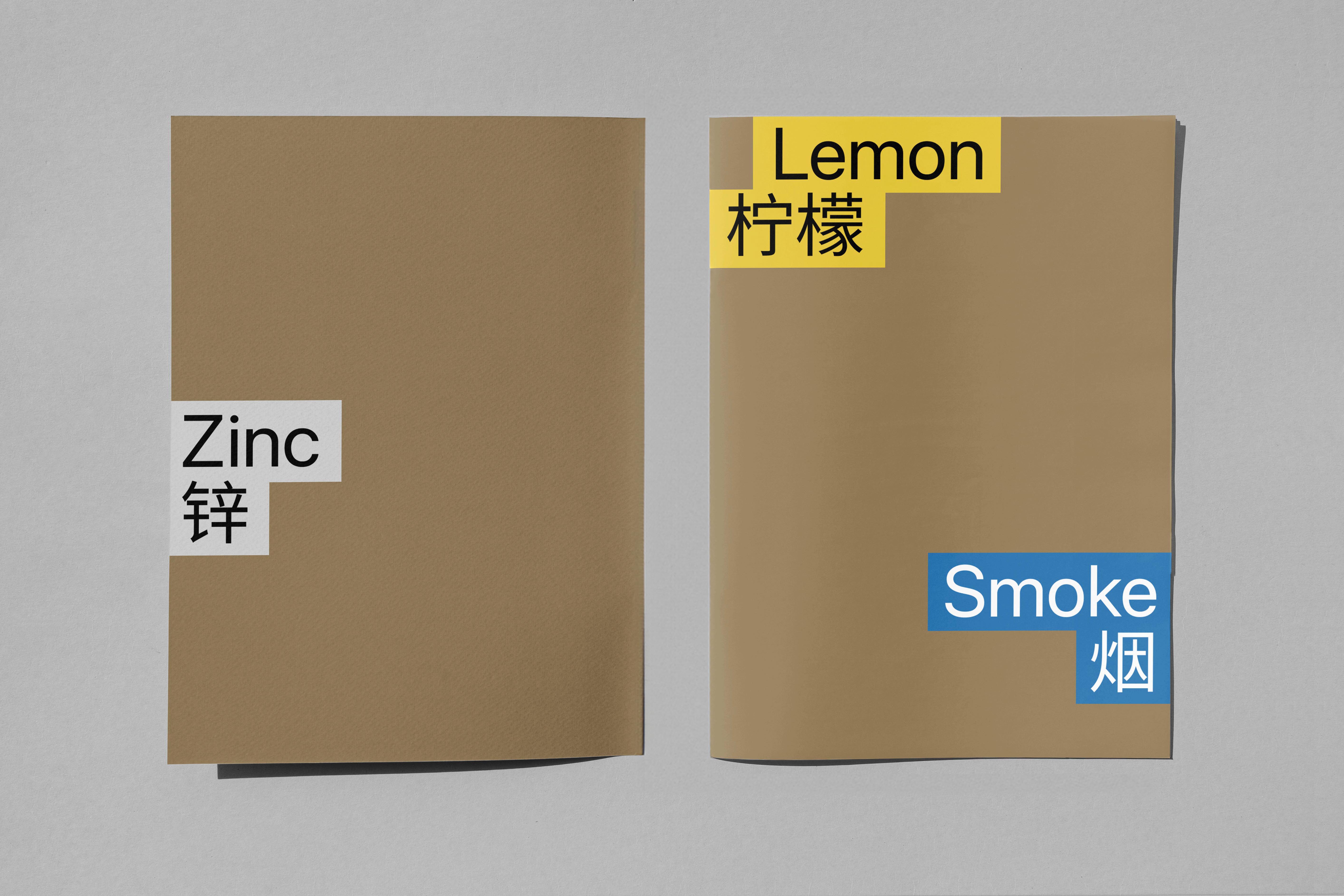
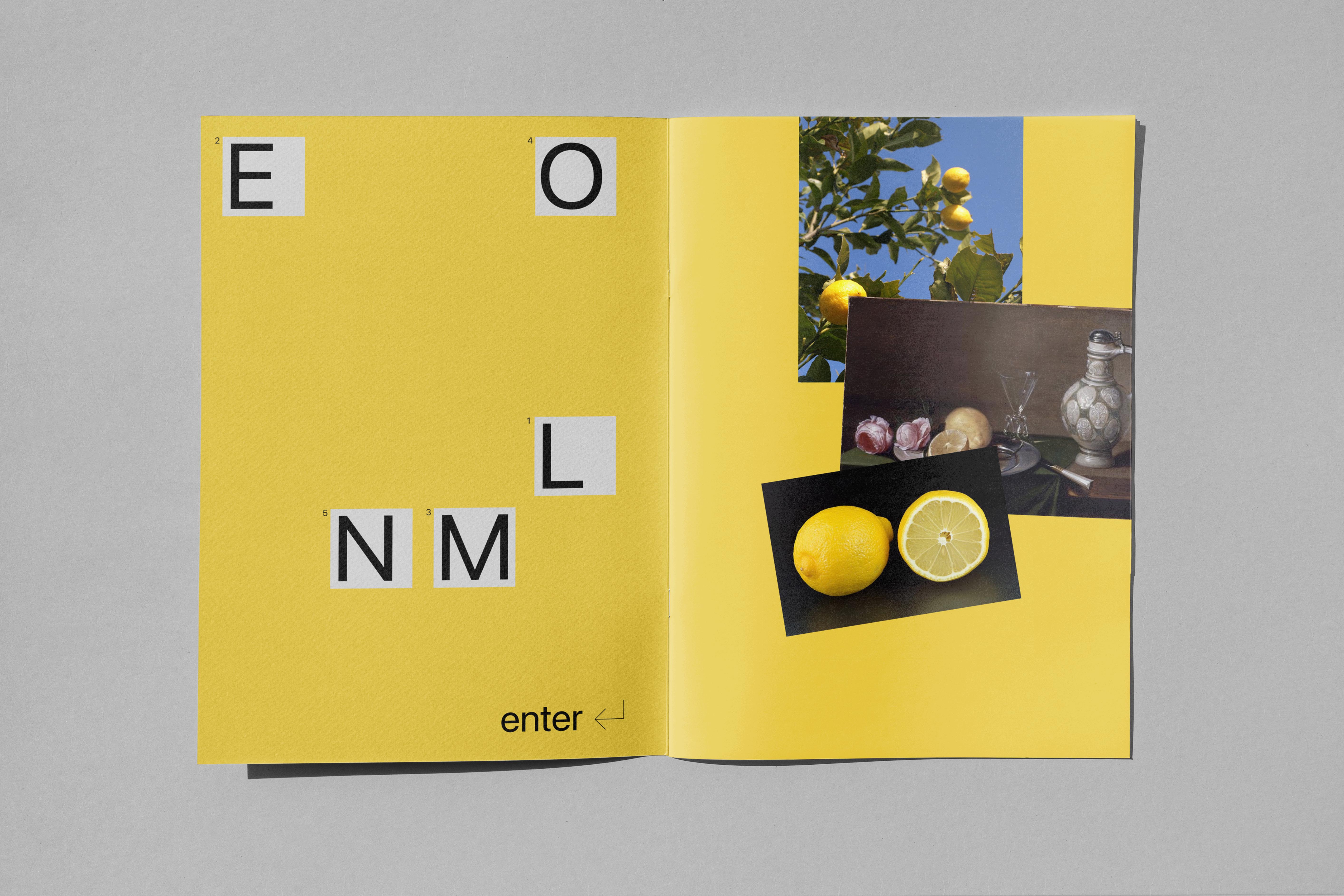
Lemon, Zinc and Smoke
This zine documents the poster series designed in the Wiptych Workshop, and the process of creating them.
Wiptych Workshop
- Navigate from your starting point to your ending point ONLY through links in the body of the Wikipedia page you’re on. You may use command + F to find words or links. When you click a link, open a new tab so that your “history” is easily traced.
- Make a series of 3 compositions using yourstarting point, your ending point and at least one point in between. For example, if your starting point was “Dinosaurs” and your ending point was “Pink (singer)”, an in between might be “Rocks”. You would then use text and images from those 3 pages only.
2020
Zine, Experimental Poster
Zine, Experimental Poster


Chinglish
Chinglish is a bilingual magazine that explores the fascinating cultural exchanges between Chinese and English. The magazine's identity is characterized by the use of a magnet and the contrasting colors red and blue, which symbolize the tension and attraction between these two languages. The first issue, titled "The English Class of Chinese Post 90s," reflects on Gen-Z's experiences learning English. Symbolic items from the past, such as grid paper, radios, cassettes, and exercise books, are collaged together to tell the story of English learning in China.
2021
Publication Design
Bilingual Magazine
Advisor
Rachel Wiley
Recognition
AIGA Blue Ridge’s Flux Competition 2022, Winner︎︎︎
Communication Arts 2021, Shortlist
Publication Design
Bilingual Magazine
Advisor
Rachel Wiley
Recognition
AIGA Blue Ridge’s Flux Competition 2022, Winner︎︎︎
Communication Arts 2021, Shortlist


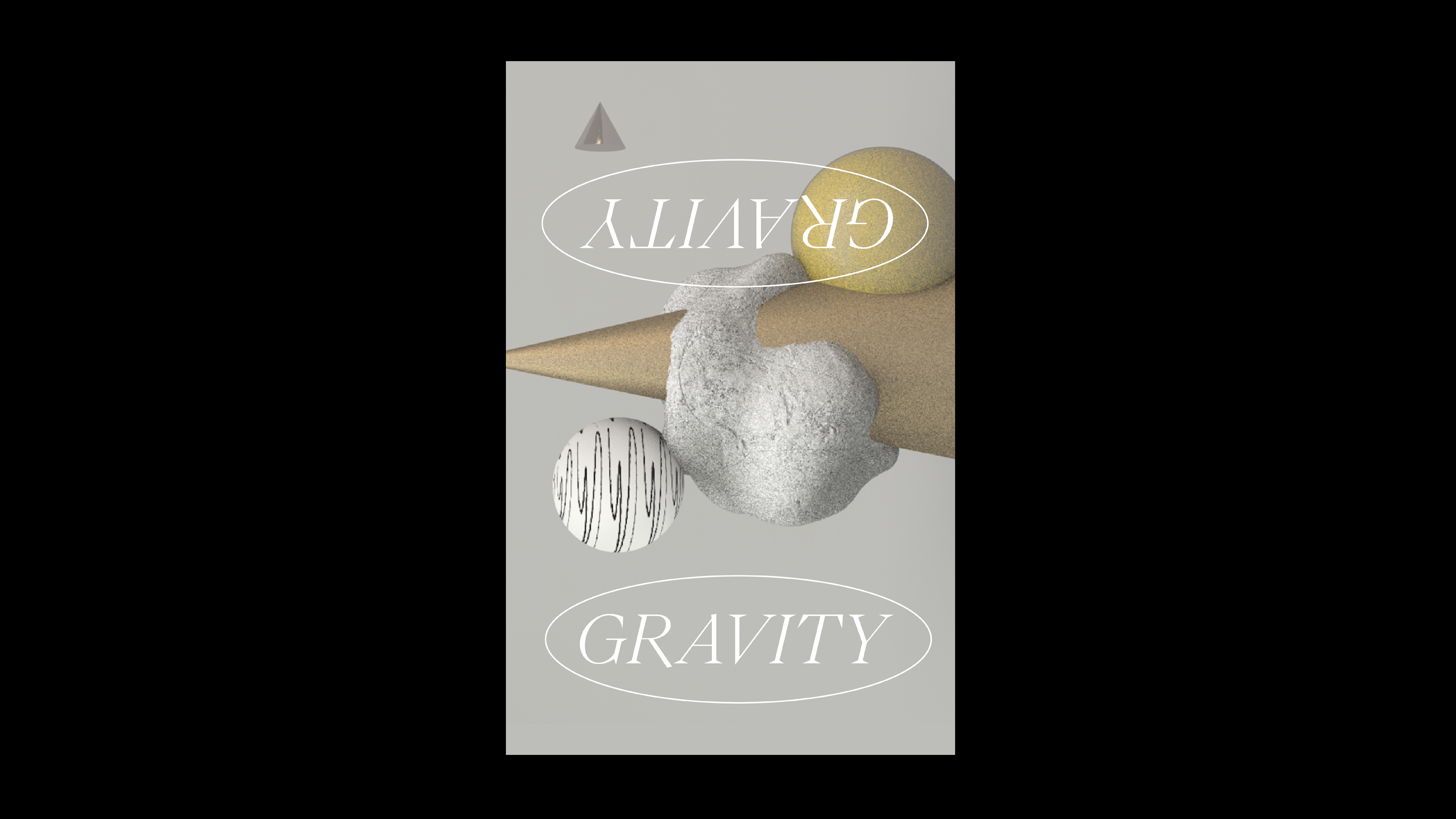
3D Sketchbook
C4D exercises that explore 3D motion, lighting and materials.
2022
3D Modeling & Motion
Advisor
Kiel Danger Mutschelknaus
3D Modeling & Motion
Advisor
Kiel Danger Mutschelknaus

Domino B

Emotive Bubble – Joy
Emotive Bubble – Remorse