Outpost
Rebrand
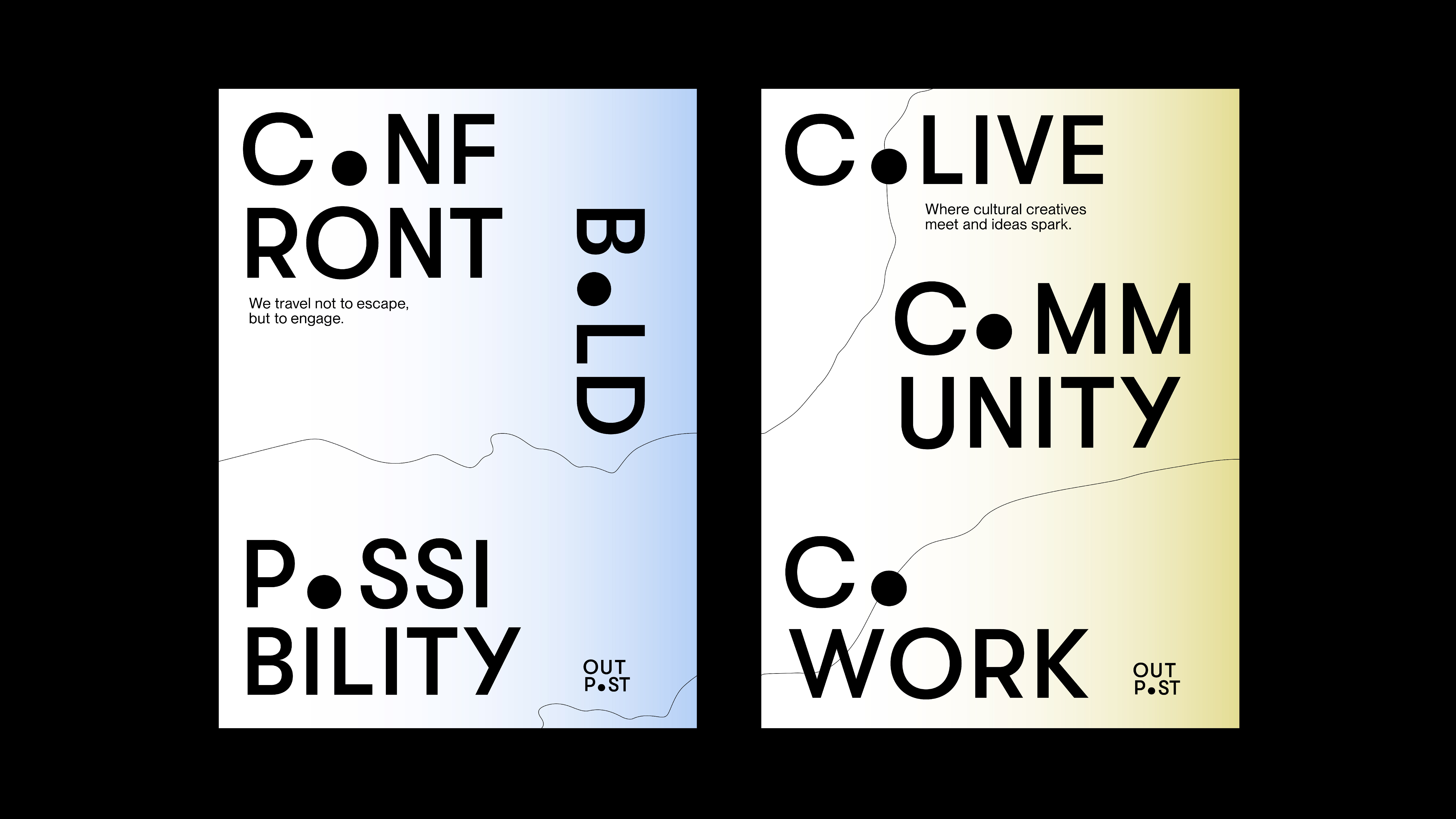
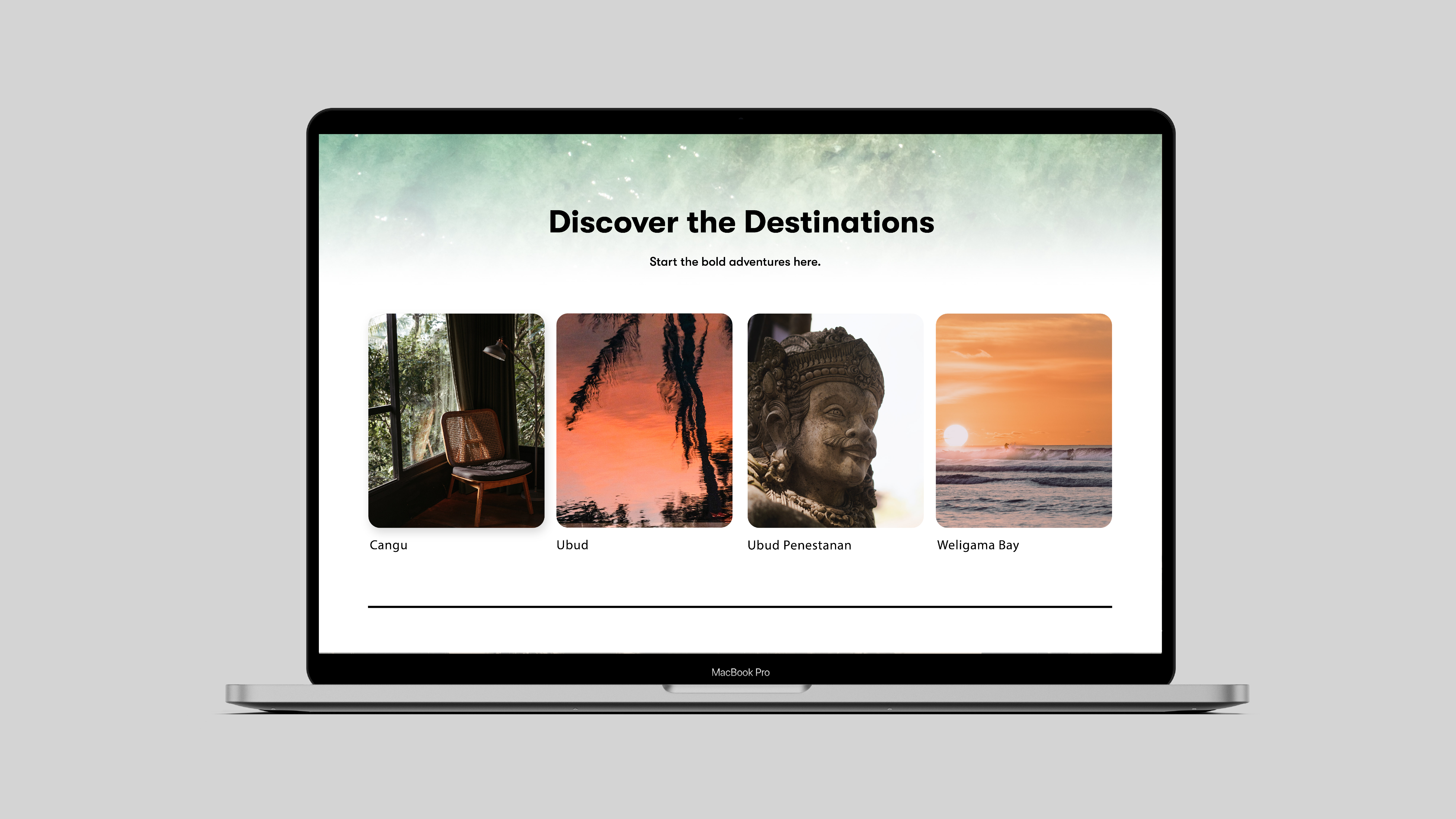
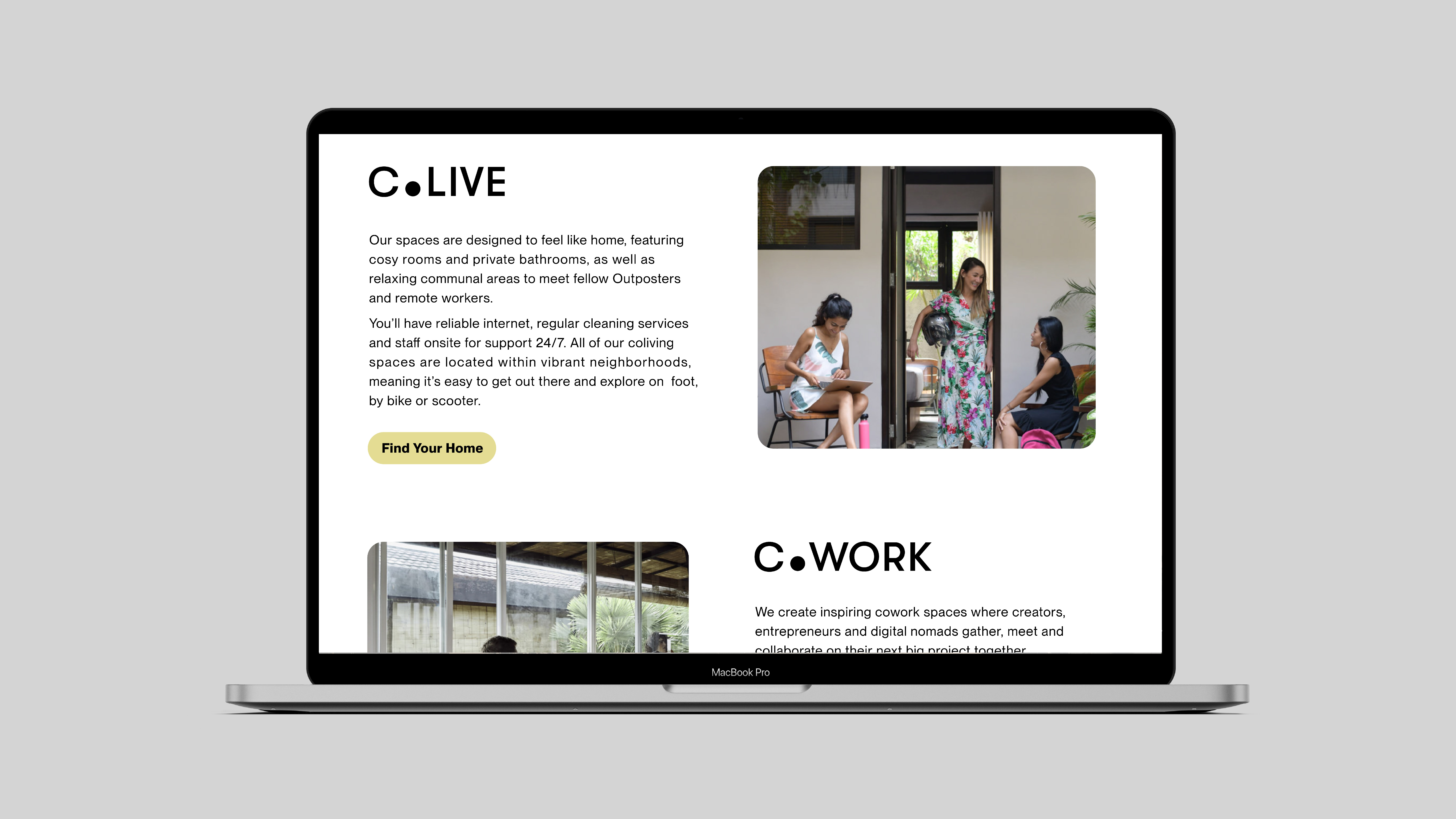
By blending the convenience of co-working and co-living with the excitement of cultural exploration, Outpost provides a truly exceptional experience for remote workers. This lifestyle encourages cultural adventures, interpersonal connections, and self-exploration. The visual identity, inspired by pins on a map, conveys the idea of unfolding new possibilities in life with Outpost.
2022
Visual Identity
Web Design
Advisor
Jennifer Cole Phillips
Visual Identity
Web Design
Advisor
Jennifer Cole Phillips


The adventure with Outpost is an insipring point in your life that is worth marking.
New possibilities unfold here.
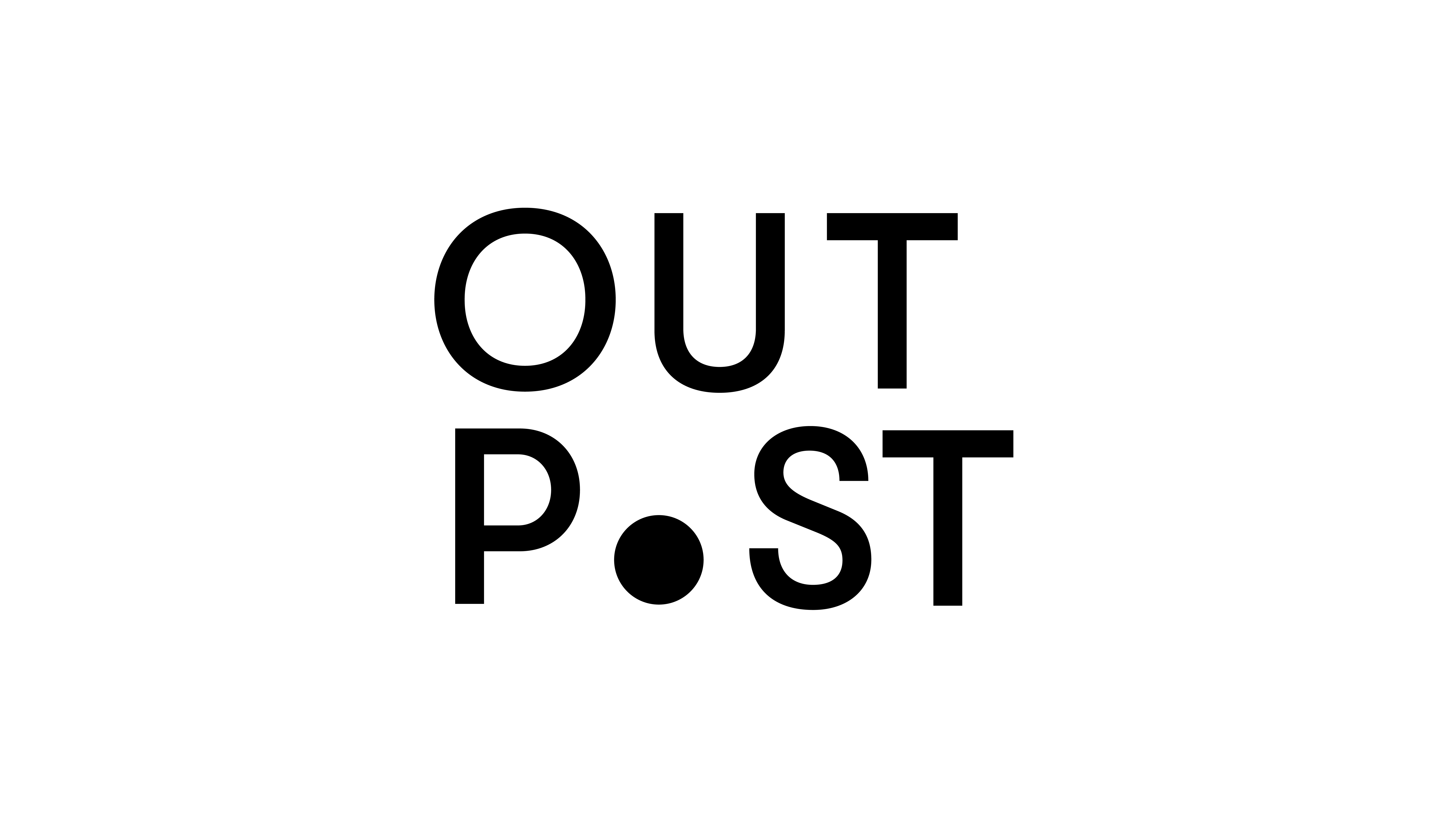
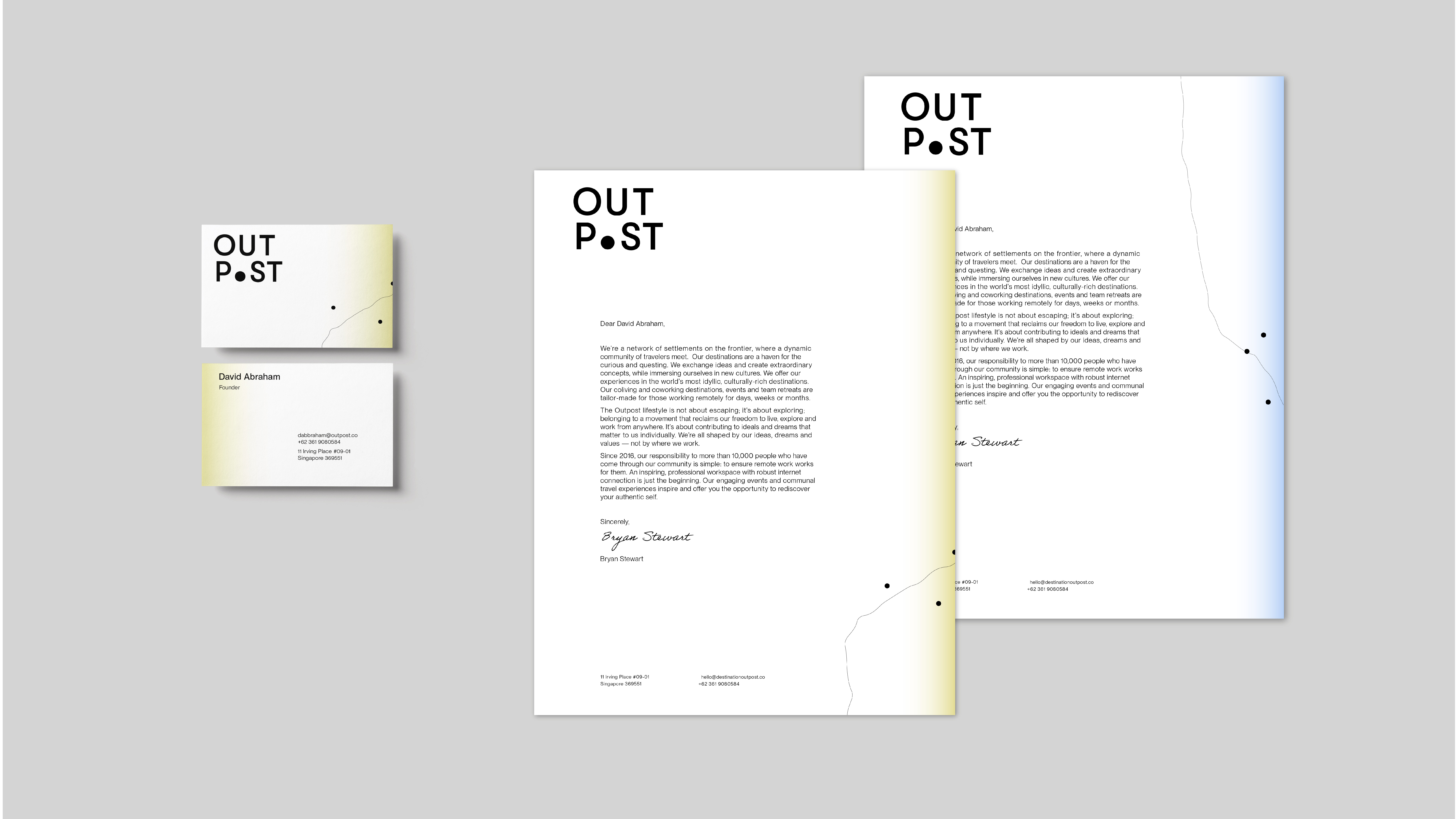
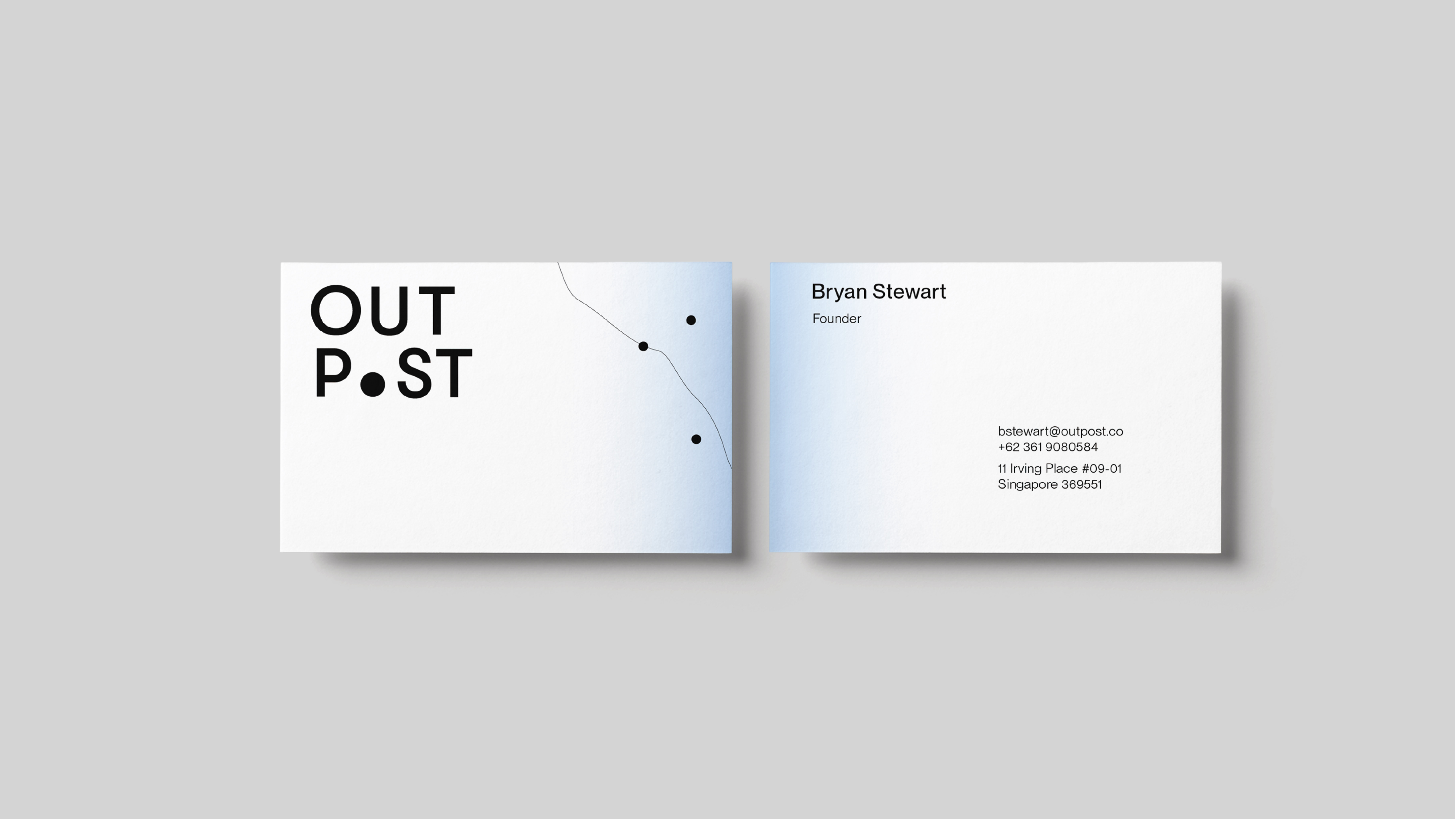
The dot in the place of O indicates a critical stop on one’s life journey. It is applied to multiple brand keywords with a letter O to reinforce the concept.